There is nothing more exciting than getting a great opportunity. A few years ago, I was in Aspen visiting friends and happened to sit next to a high energy blonde showing photos of her home she designed herself. I had just launched the blog that summer and was very eager to see what this obviously chic woman had created in her San Francisco home. I was not disappointed. I knew one day I would have to see this house in person.
I am not one to easily forget things and last weekend proved to be the ideal opportunity. I made my way over to her beautiful home that was built in 1904. With a Miles Redd mentality, Kathryn Lasater created a boldly colorful and unabashedly chic retreat for her husband and three young children. Every room was full of strong complimentary hues and patterns. Every corner was crafted with family heirlooms or well curated antiques. This was not an easy project to take on sans designer, but it is testament to her fabulous taste and enthusiasm for fashioning a home that was every bit as lively and colorful as she.
Apologies- I did not have this visit planned in advance and many photos are different sizes. Most photos were taken on my iPhone on a very sunny evening, other photos were taken by Kathryn Lasater.
All decor by Kathryn Lasater.
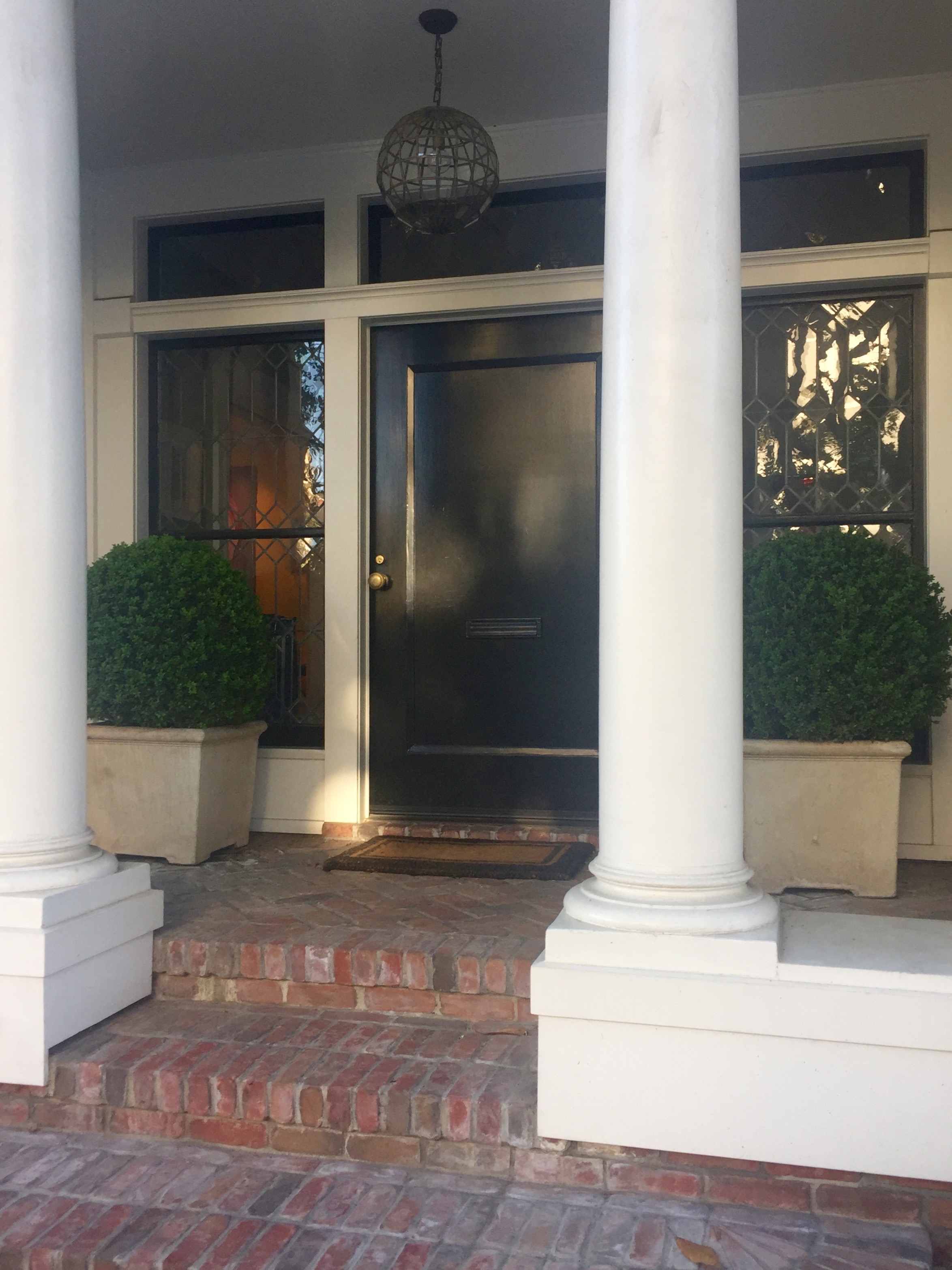
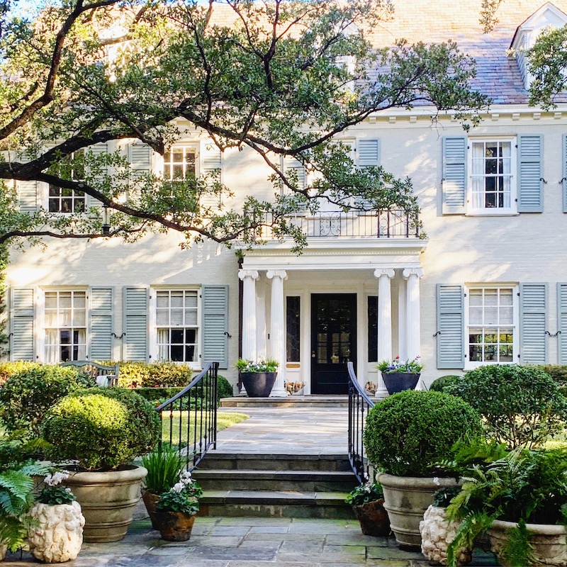
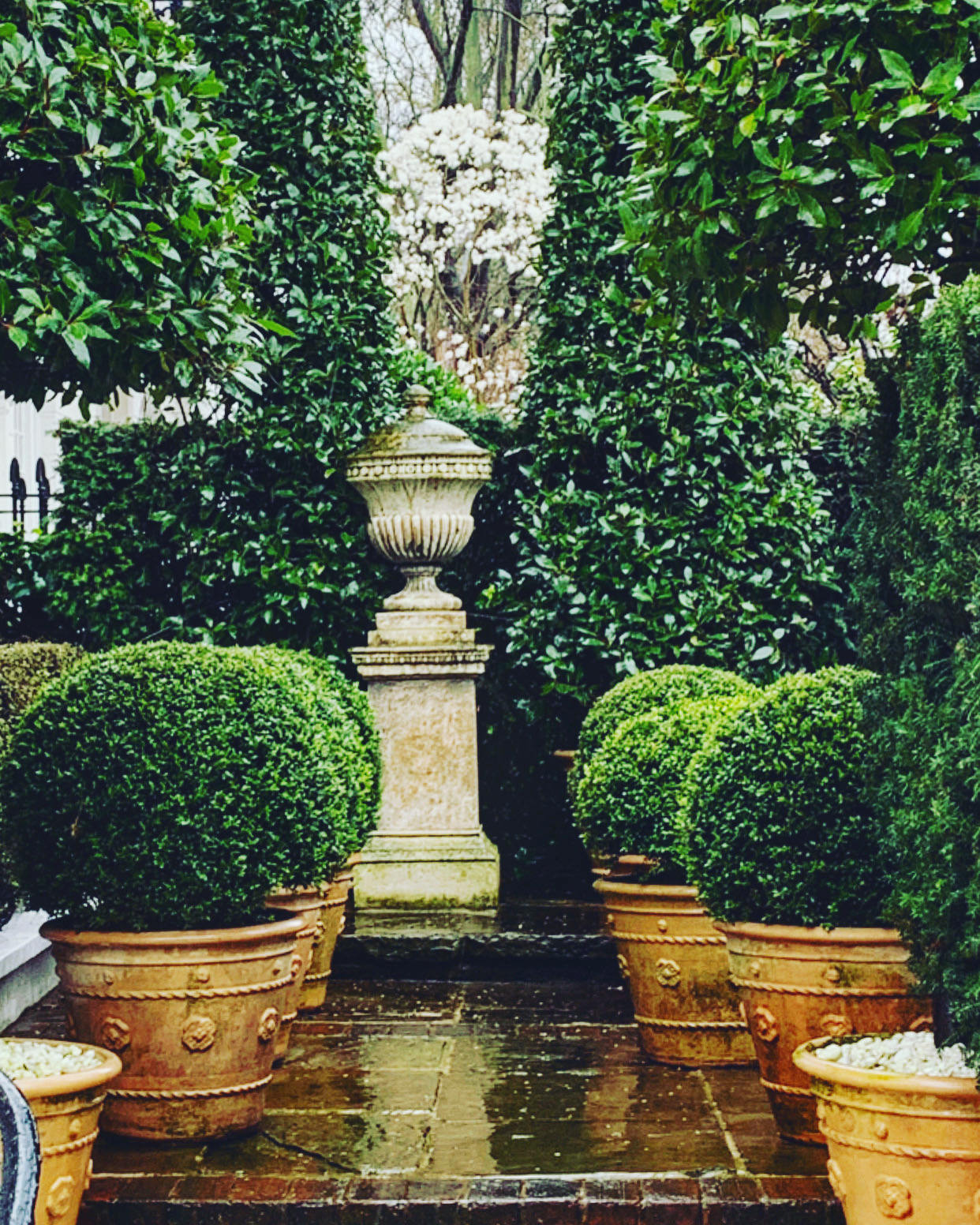
Bold and beautiful boxwood flank the front door. The bigger the boxwood the better.
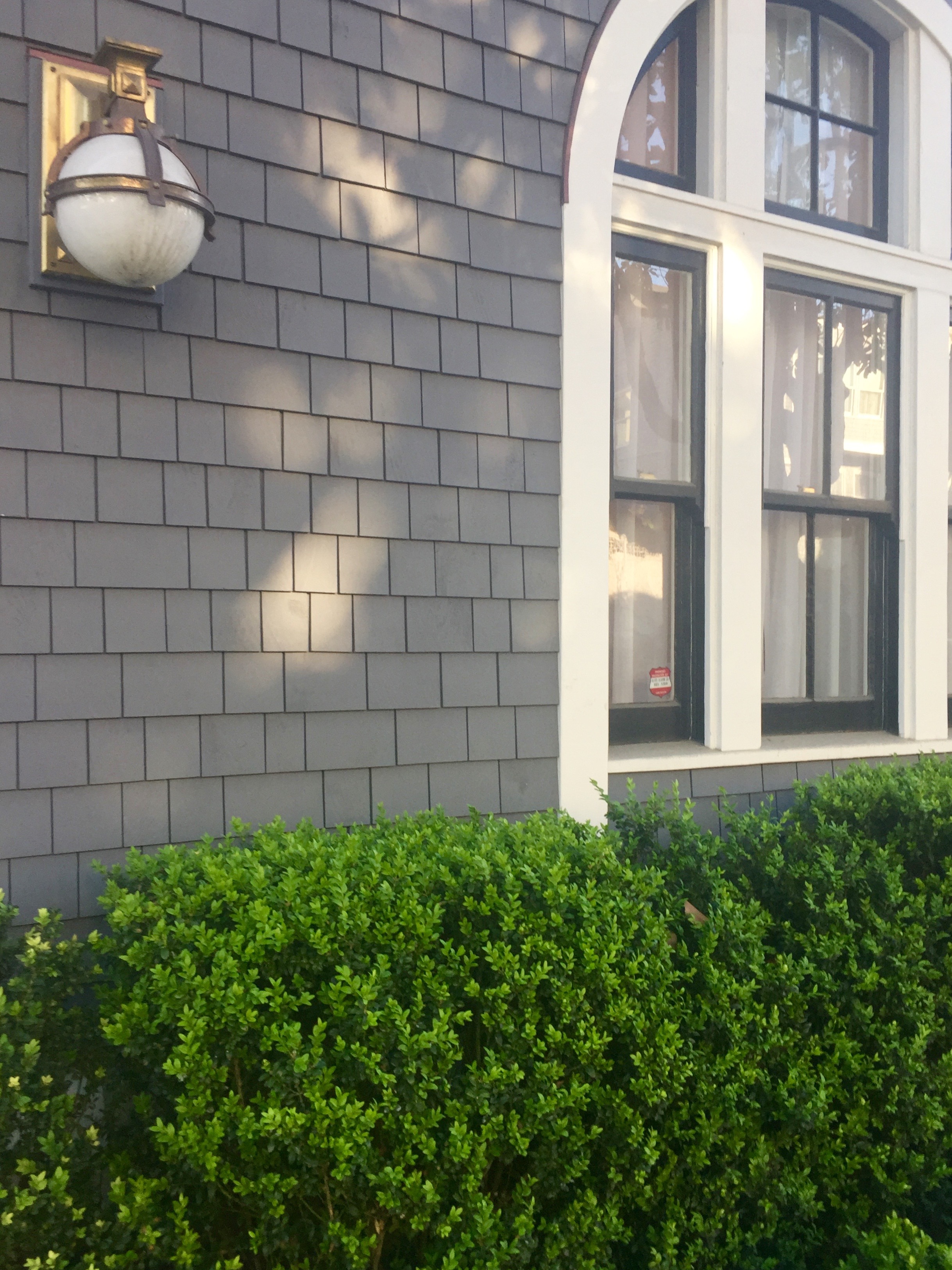
Hedges of boxwood surround the outside of the home. Kathryn has an eye for the most chic and unique light fixtures. It is a common thread throughout the home.
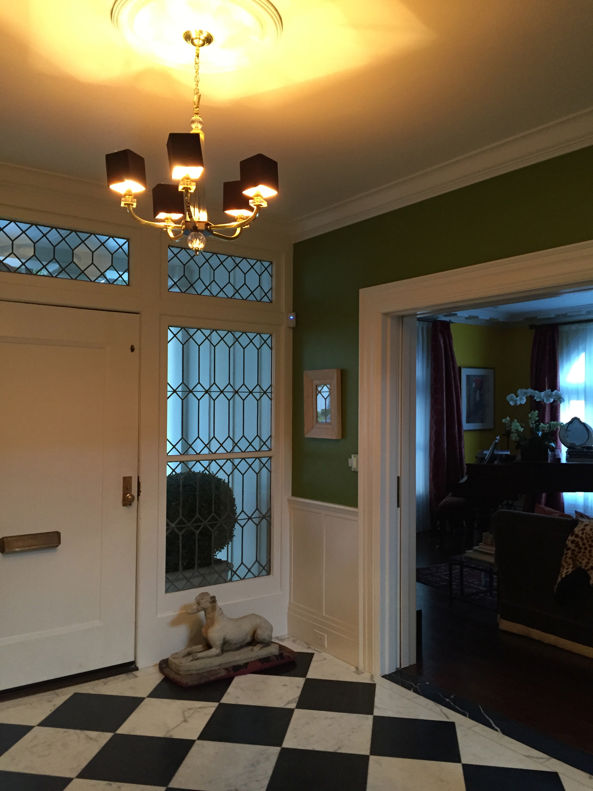
The foyer. Love the checkerboard floors!
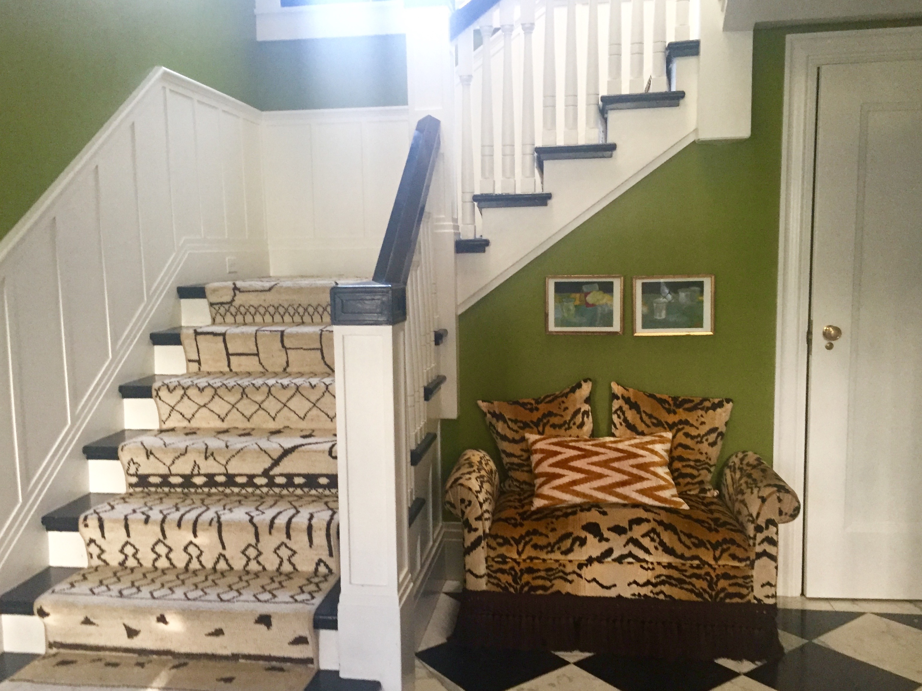
The entry. An incredible runner, a vivid green, and a popping tiger pattern greet you right away. You automatically ease up and prepare yourself for amazing visual eye candy.
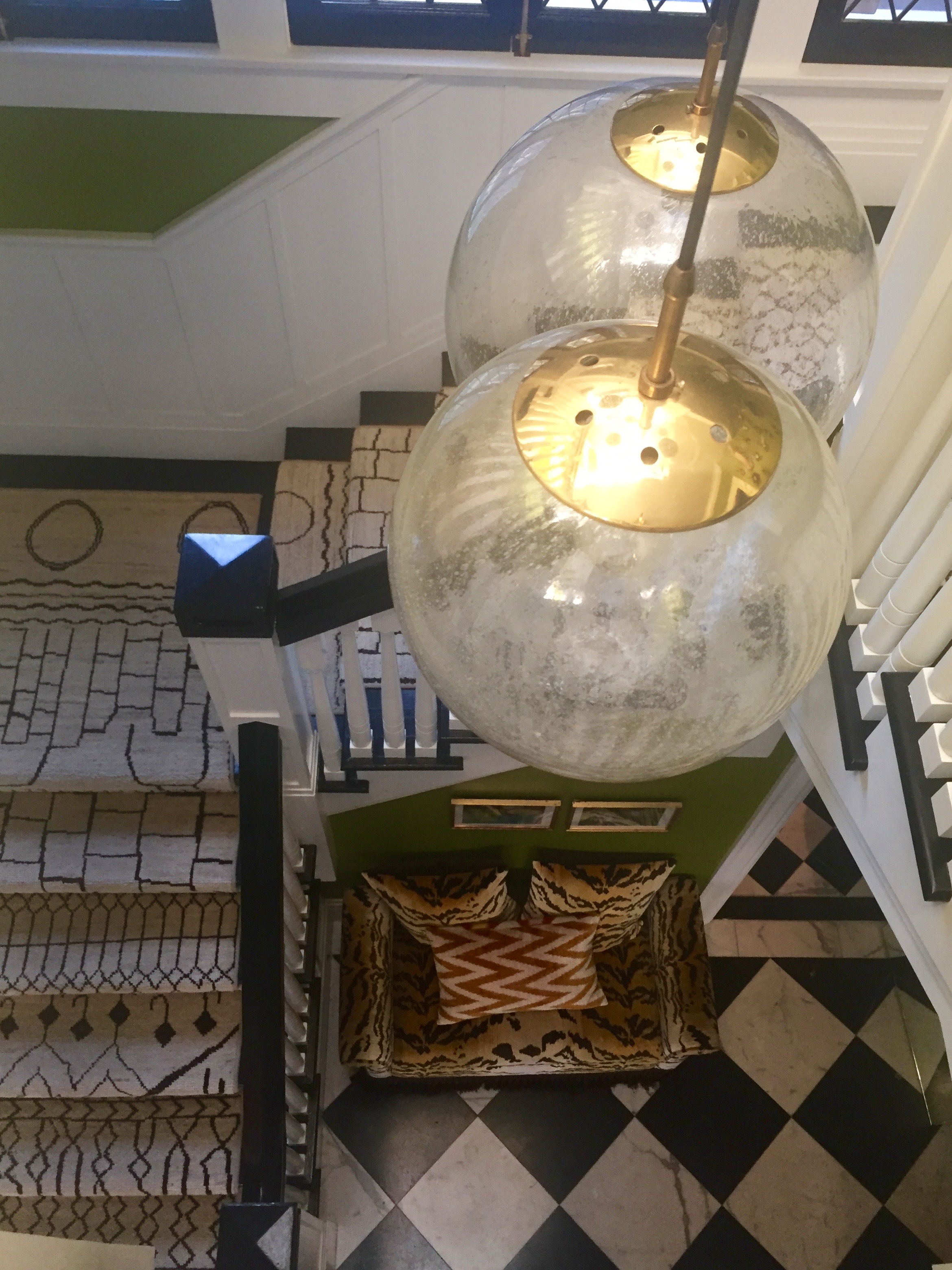
An aerial view. The light fixture is an original and hangs down from the third story and catches your attention from the first floor. It is unlike anything I have ever seen. So very layered and adds the right amount of panache!
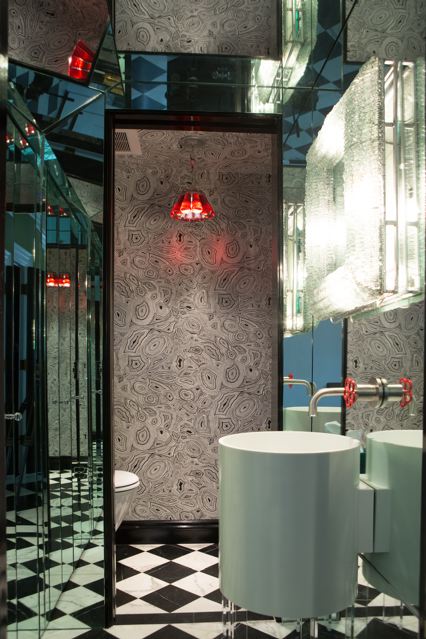
The bathroom right off of the entry is beyond. Wall to wall mirroring, black and white agate inspired paper, and a very cool cylinder shaped sink.
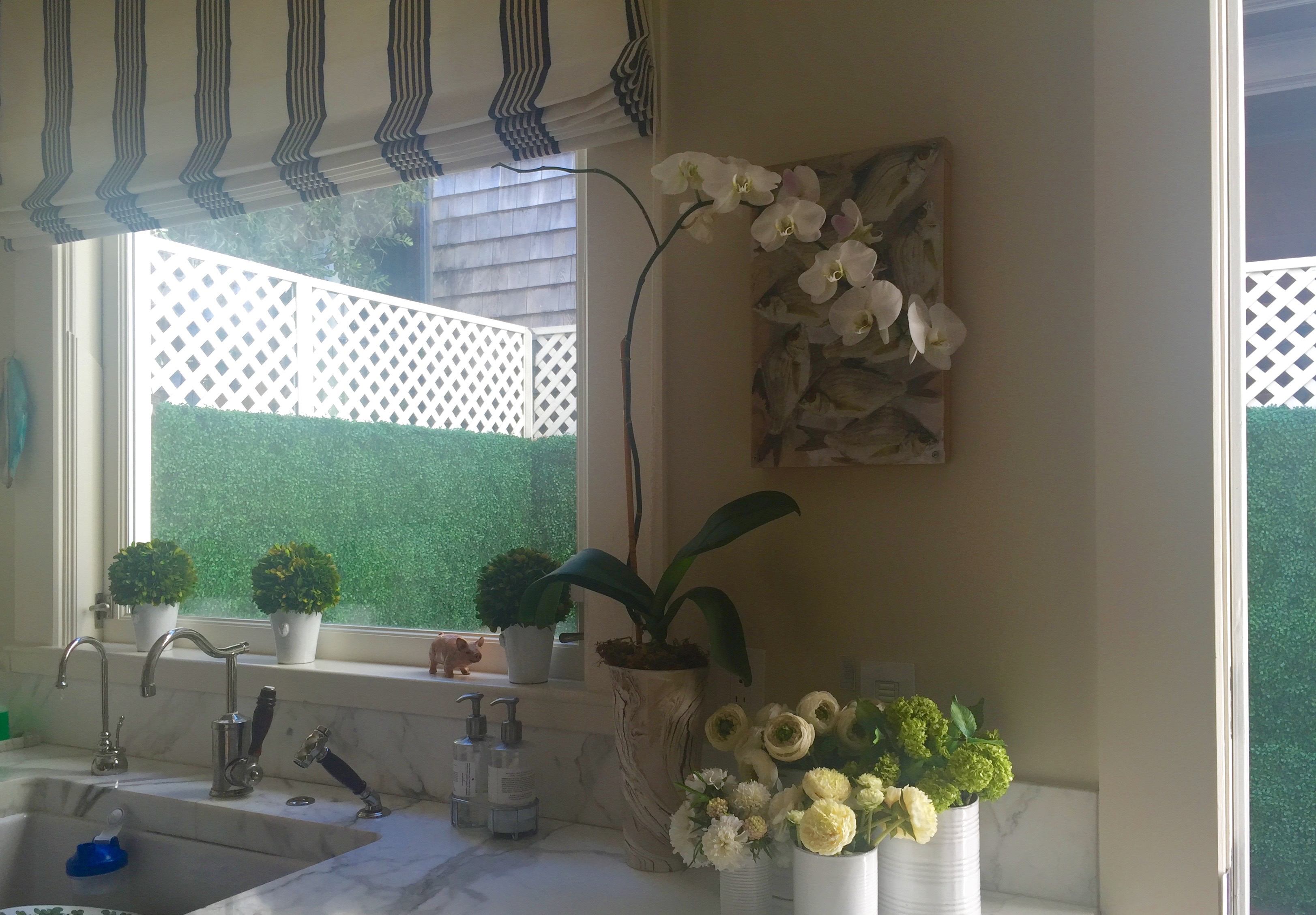
A glimpse of the kitchen and the outdoor boxwood walled courtyard. When the sun is out, a blue awning can cover the entire space. I really love the roman shade here.
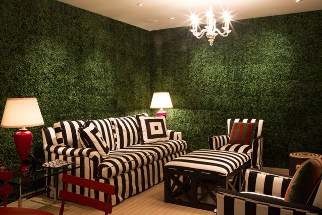
The basement area. This is an image that has been ingrained in my head for almost two years. Bold black and white stripes, pops of red, and walls of boxwood. She painted the walls underneath the faux boxwood in green, in the very likely chance one of her kiddos decided to do a little picking.

The hallway down into the basement is almost unexpected in the form of bark and branches, but it plays so complimentary to the black and white in the basement sofa.
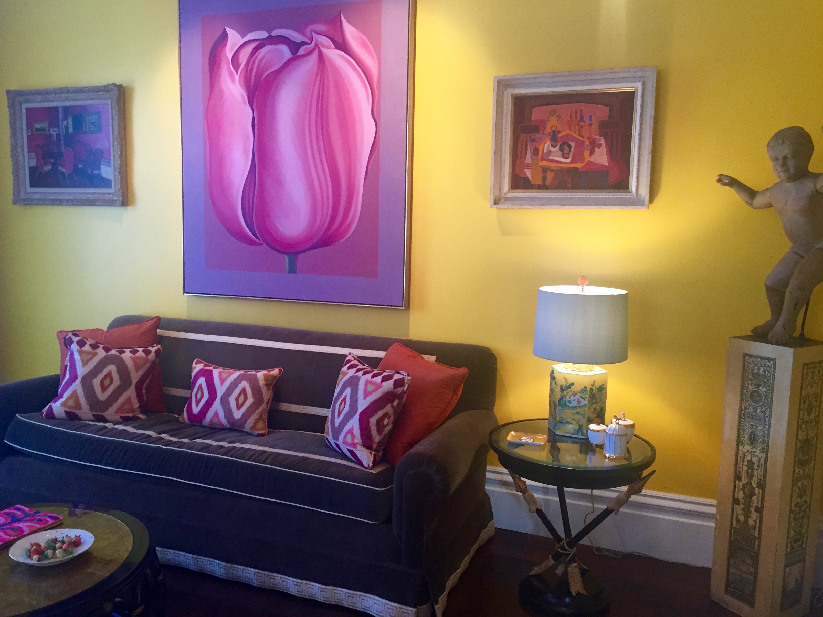
Back to the first floor, A very colorful and eclectic living area. A vivacious mix of antique and modern.
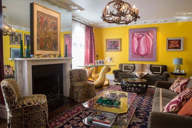
I love the mirrored area around the fireplace. Oriental rugs and leopard chairs add the right amount of flair.
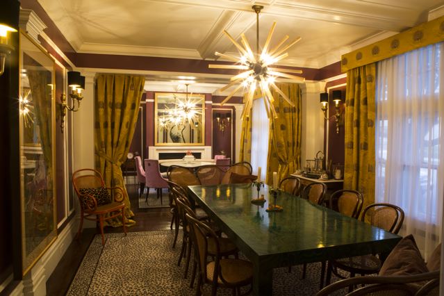
The dining room with a malachite inspired table. Could you imagine blue and white china against this luxe shade of green?! Swoon.
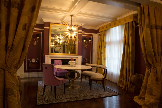
A glimpse into the other dining area. The light fixtures are wow worthy, the carpet is leopard, and strong colors of green, purple, and yellow find a way to compliment each other in such a grand form.
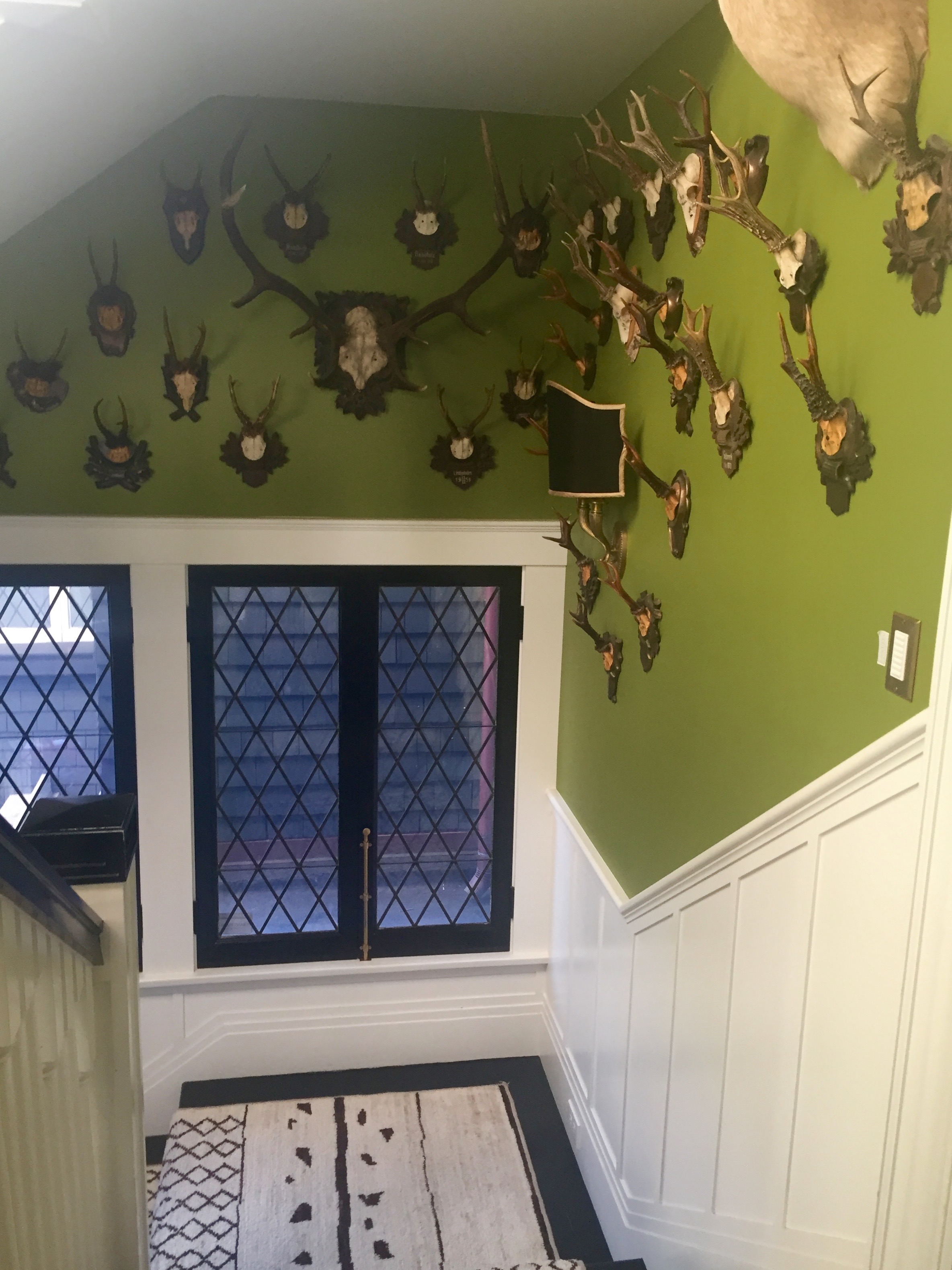
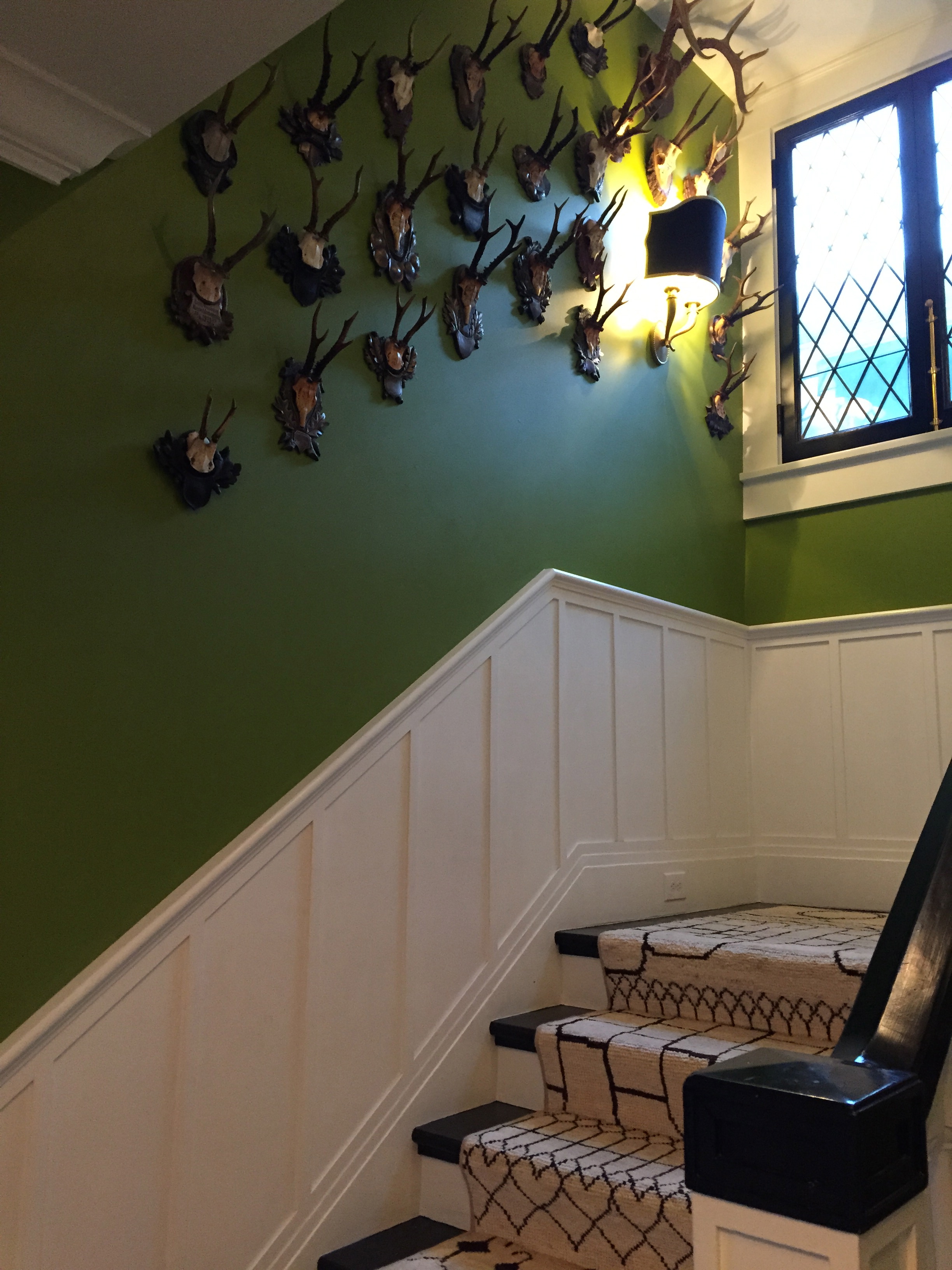
The stairway. This may even be my favorite image. Between the windows, the antlers, the paint, and the runner, it is hard to not be happy when looking at this picture.
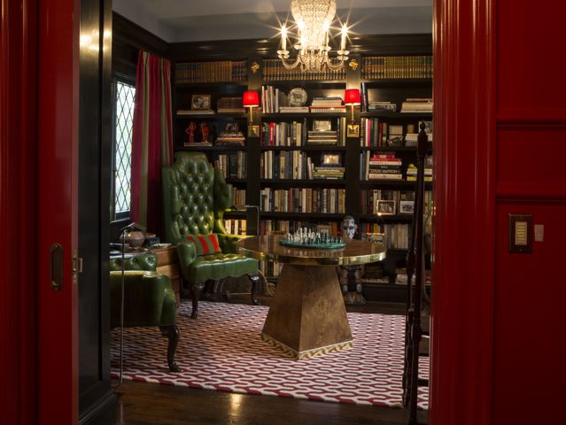
The den at the top of the stairs. I always love the sconces on bookshelves.
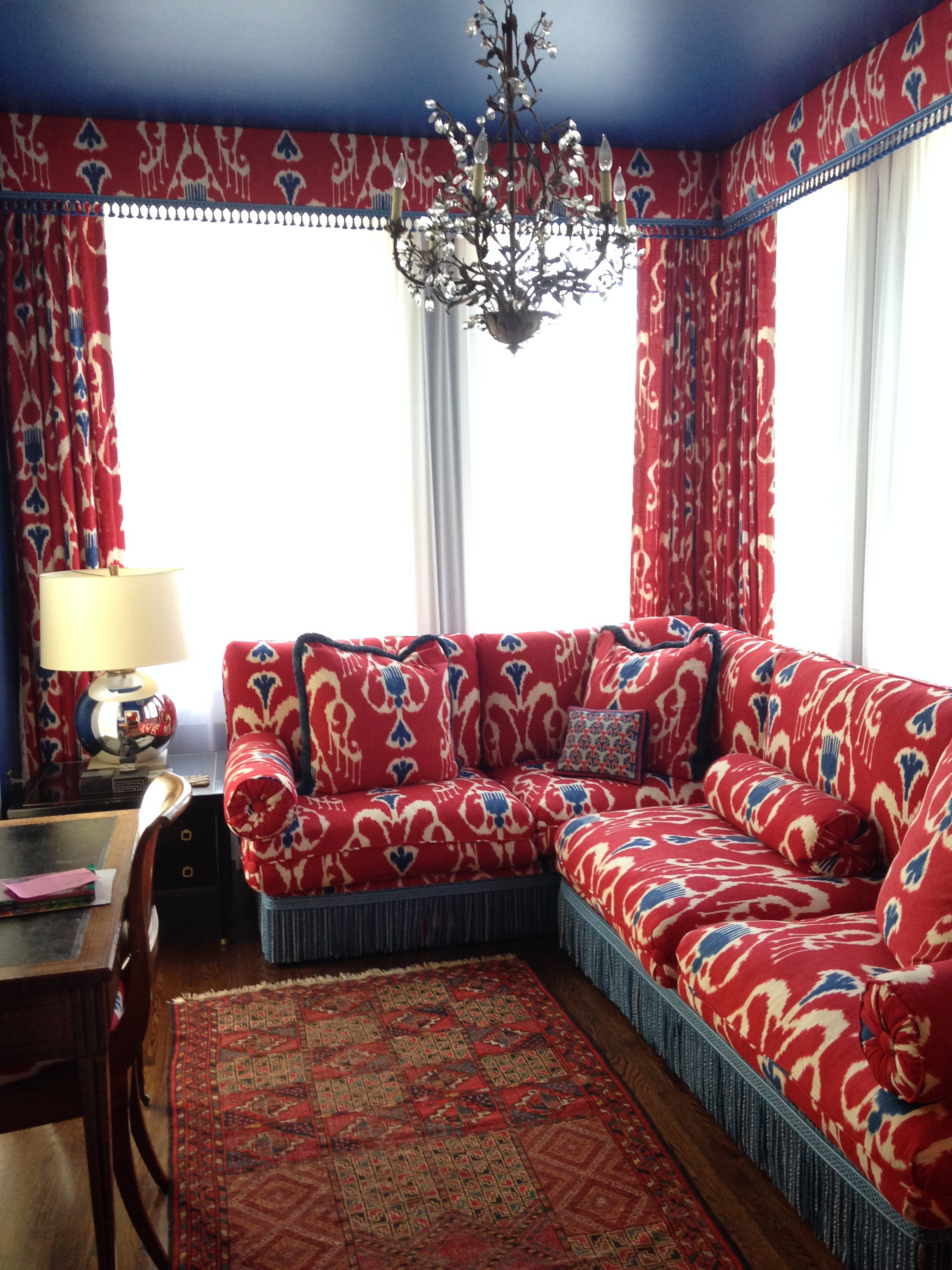
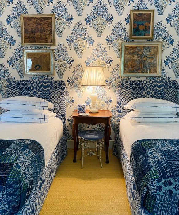
Another area that can double as a guest room. I love how Kathryn was not afraid to go big with pattern and even bolder with color. 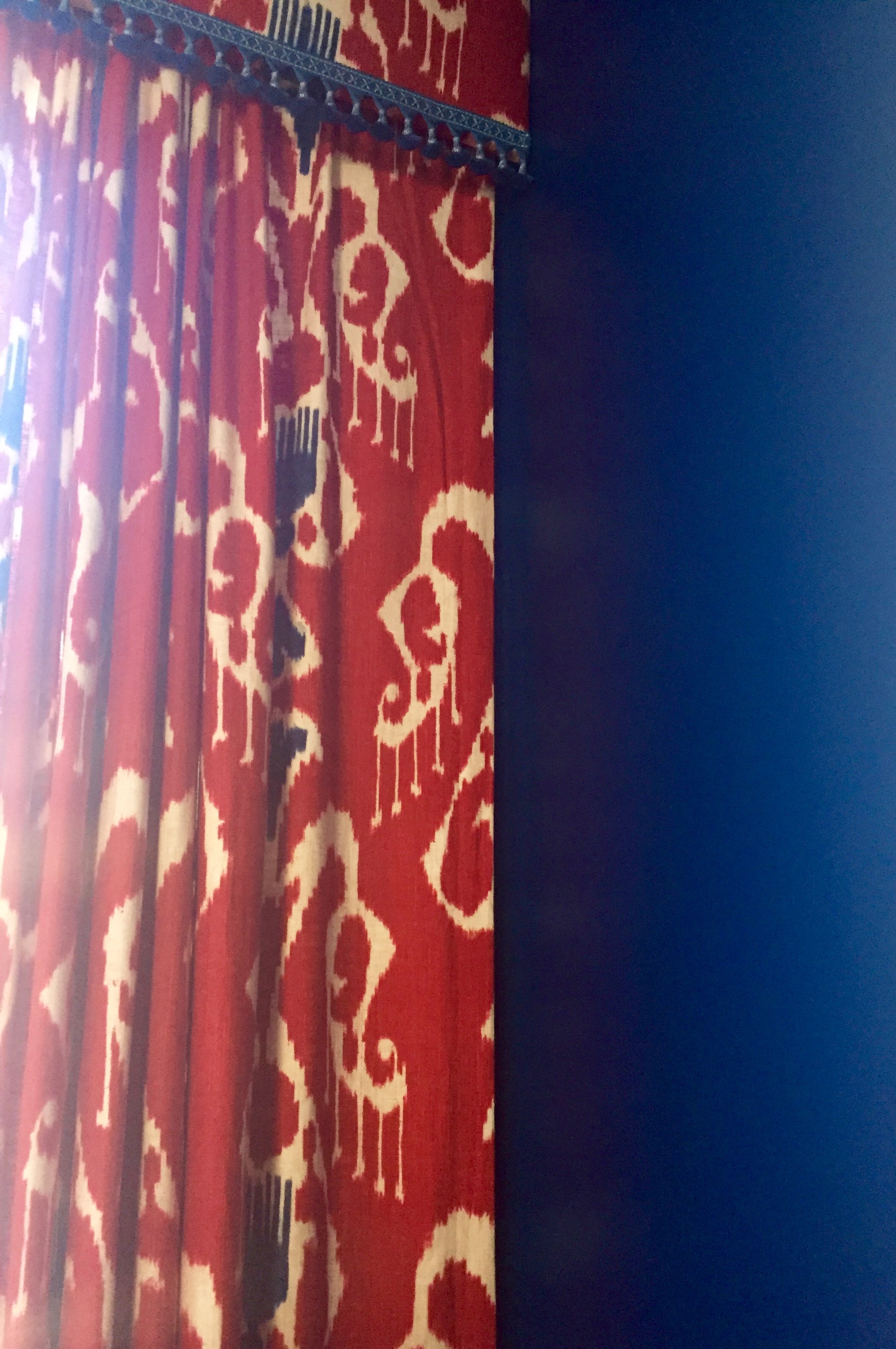
A better image of the colors. Look at that royal navy paint color.
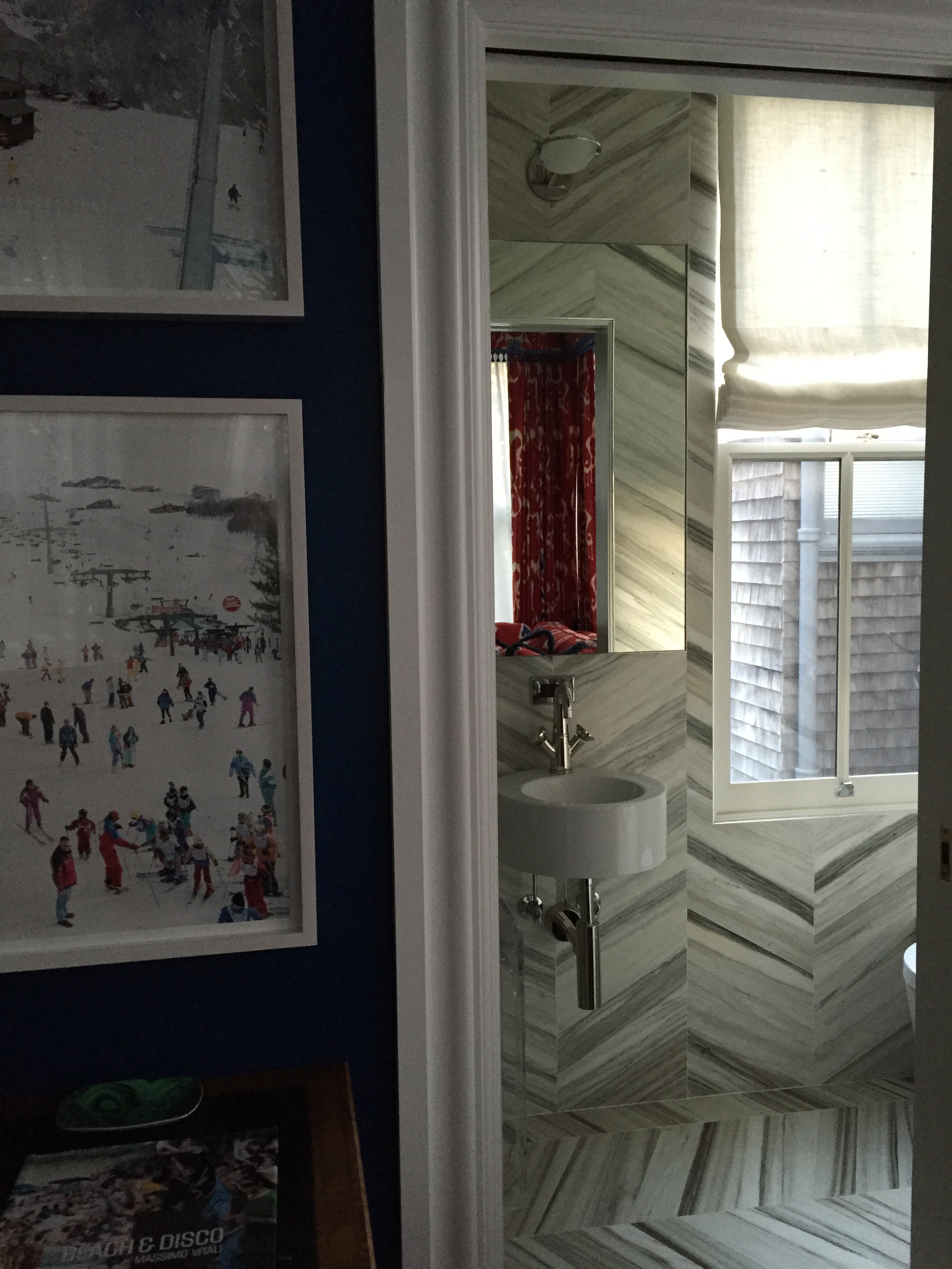
A chic second floor powder room.
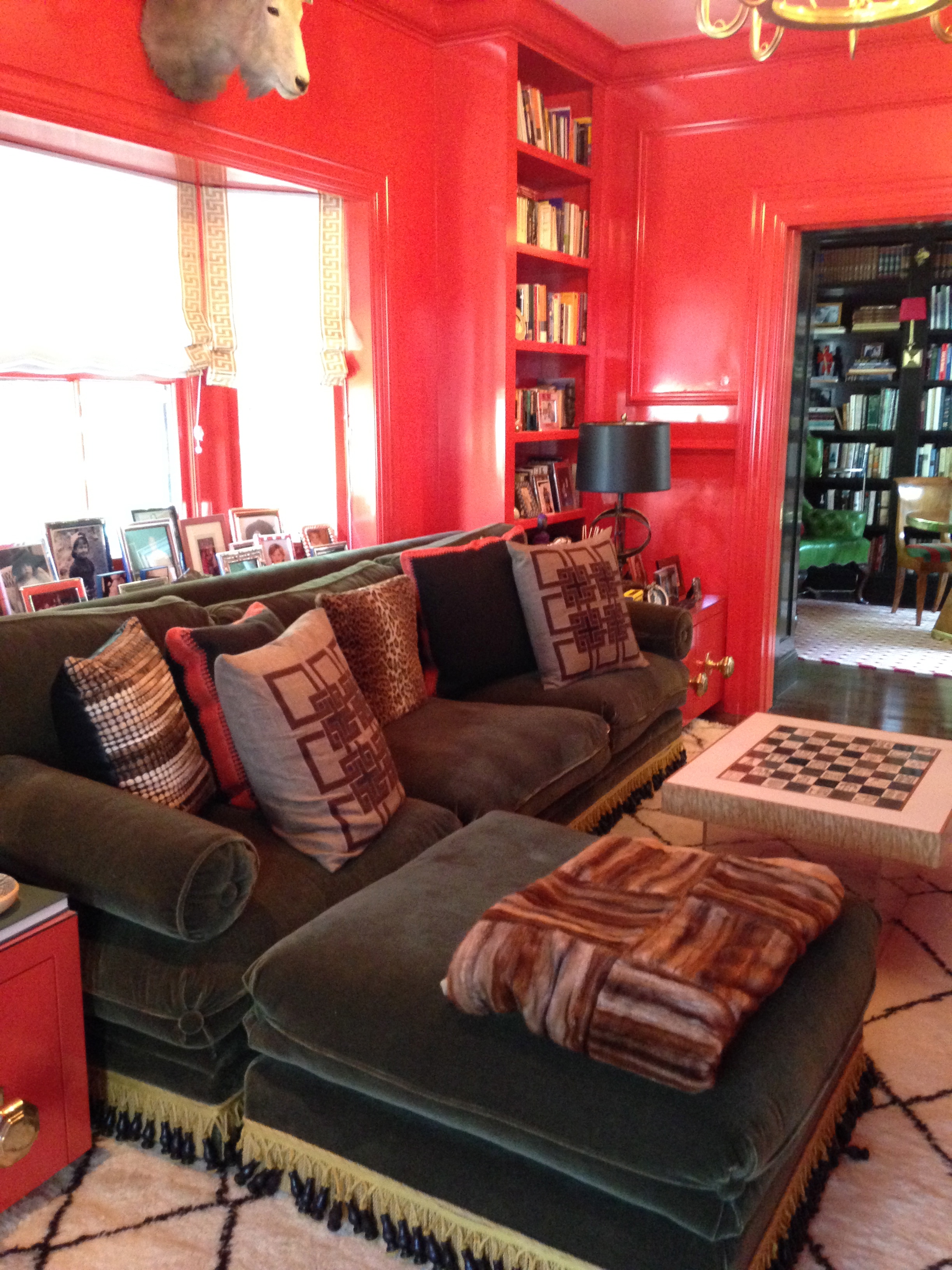
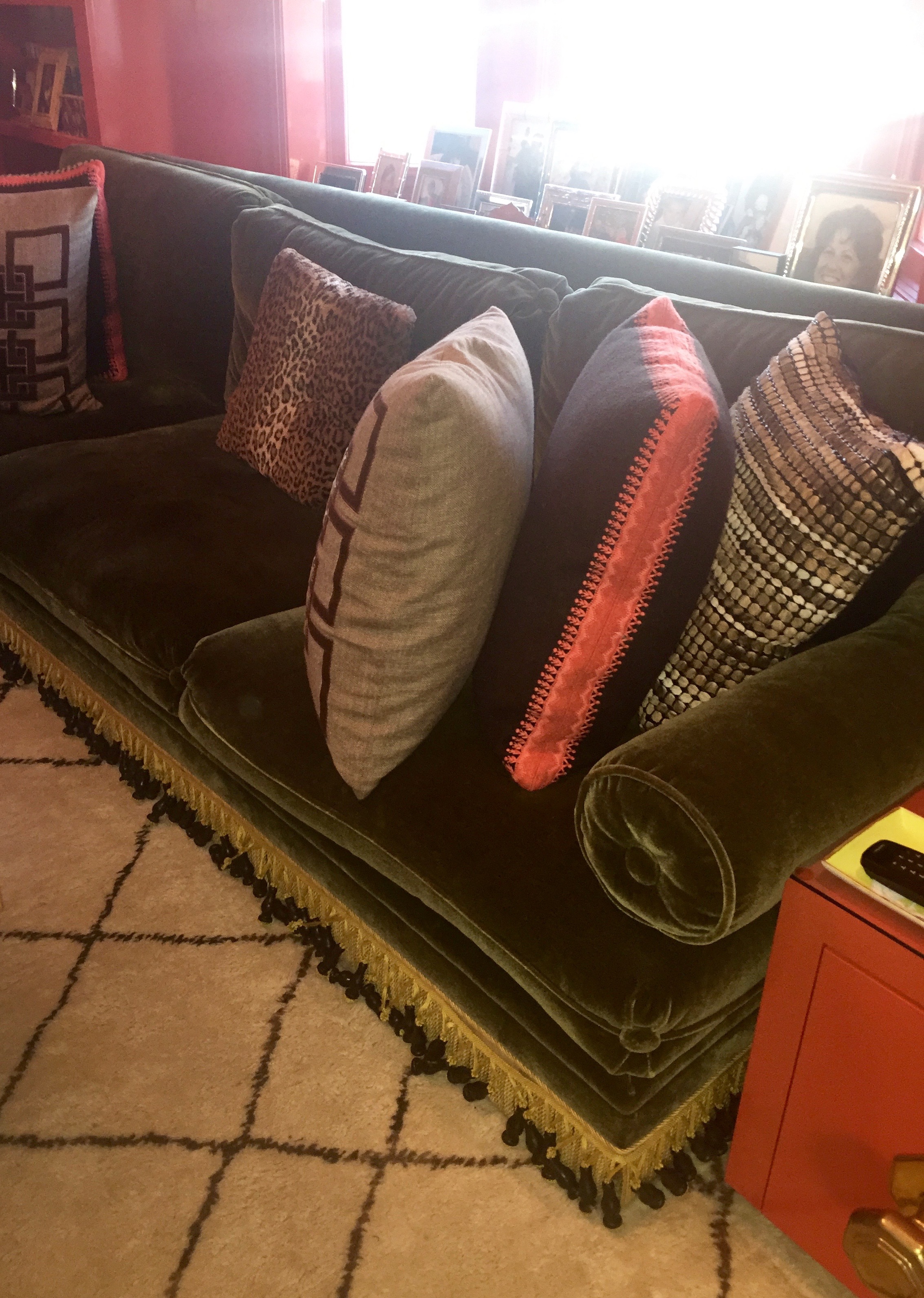
Now entering the main living space for the family. A velvet green sofa in a Tory Burch orange room. Highly lacquered and full of gumption.

The hidden bar area next to the fireplace. Are you all drooling yet?!
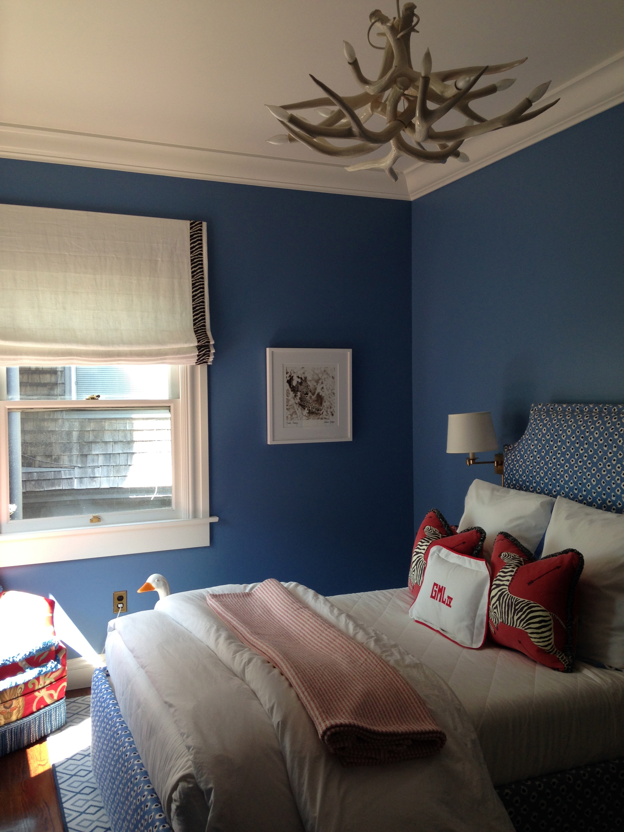
I really fell in love with her son’s bedroom. We both looked at each other with a sense of foreshadowing that as he gets older, he most likely will “grow out” of this stylish space.
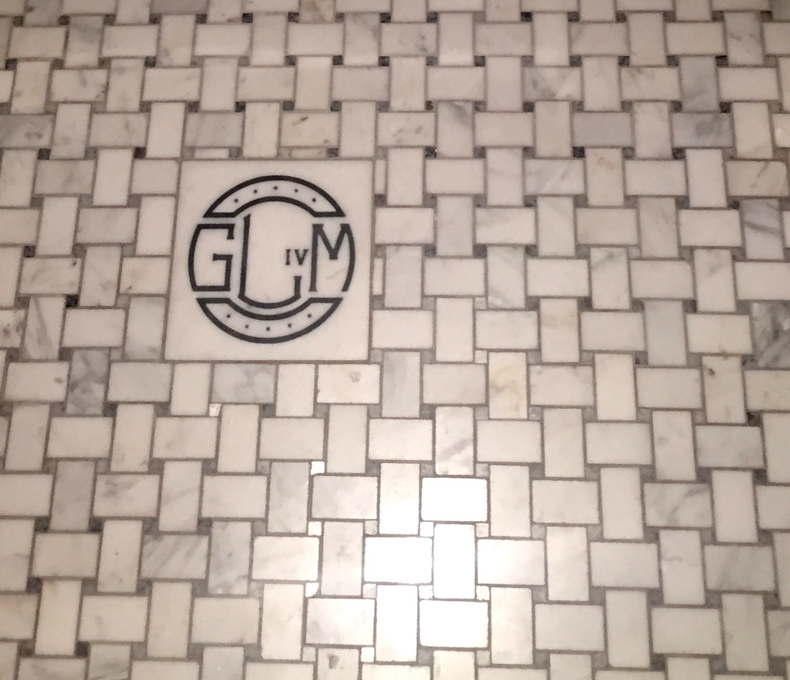
Get ready for this. She came up with the idea on her own to have a Leotine linen inspired tile. Well, unfortunately those don’t exist. So she had to come up with another plan. Who monograms tile or things like them?? Funeral homes. That’s right. She got her monogram wish, and it paid off beautifully in all of her children’s bathrooms.
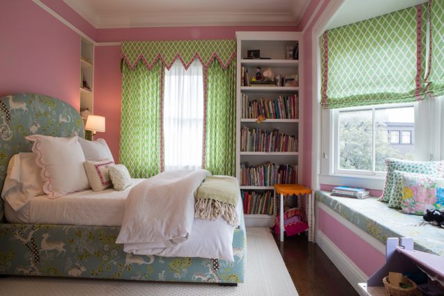
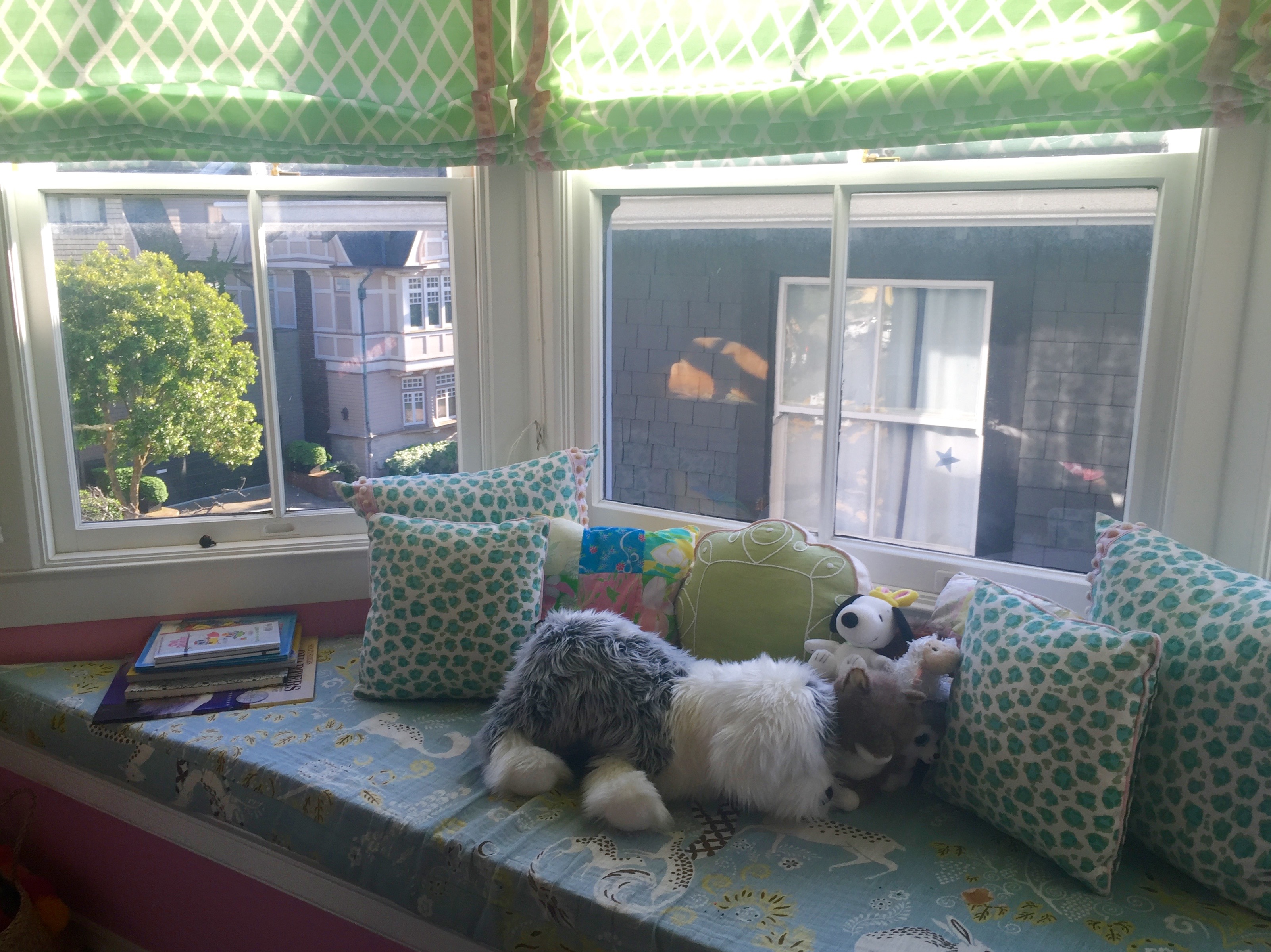
One of her daughters bedrooms. So fresh, feminine, and smile inducing. Just curious, are you still SO impressed that she did this ALL on her OWN?!

Adorable, yet sophisticated Jack and Jill bathroom for the sisters.
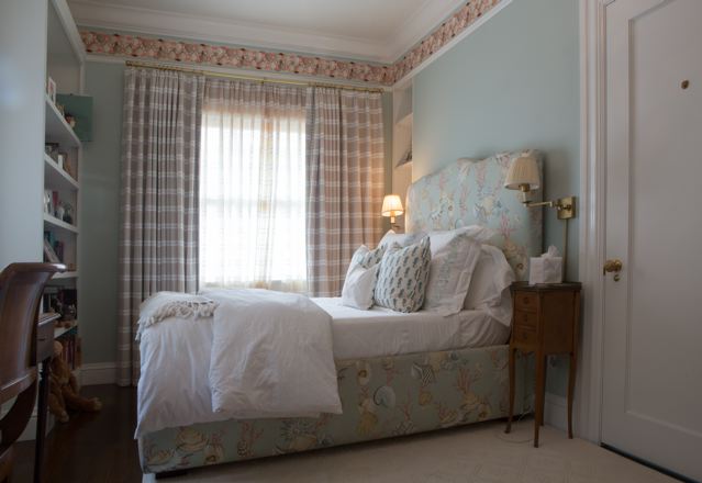
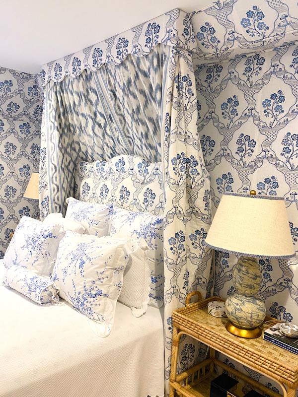
The other girl’s bedroom. So refreshing with calming and subdued patterns.
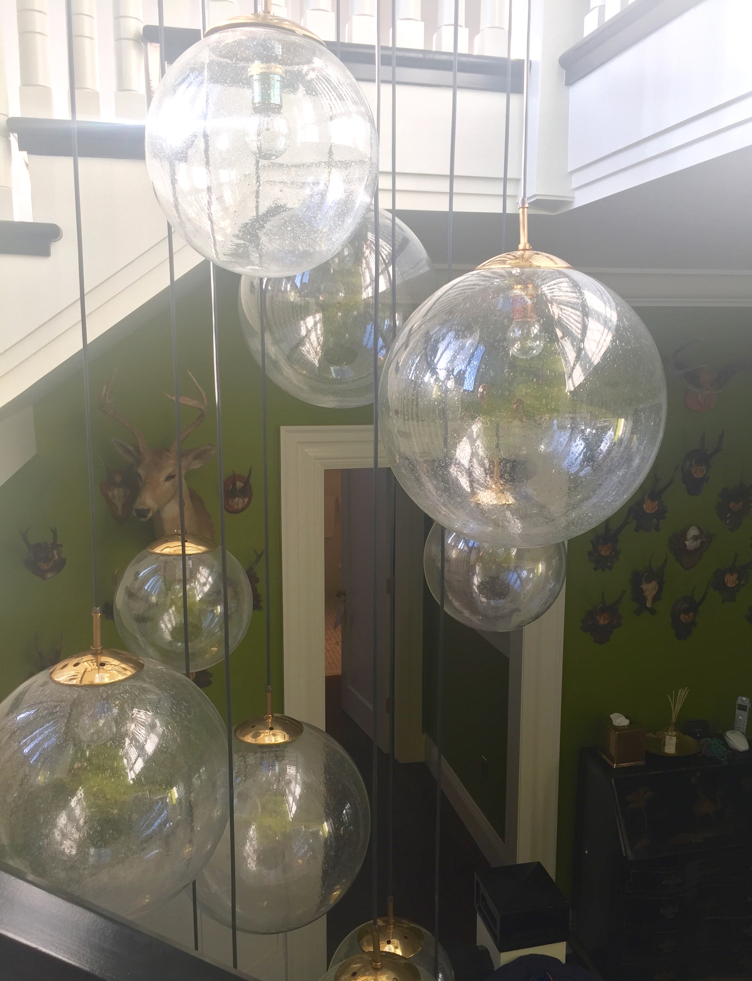
Another view from the stairs.
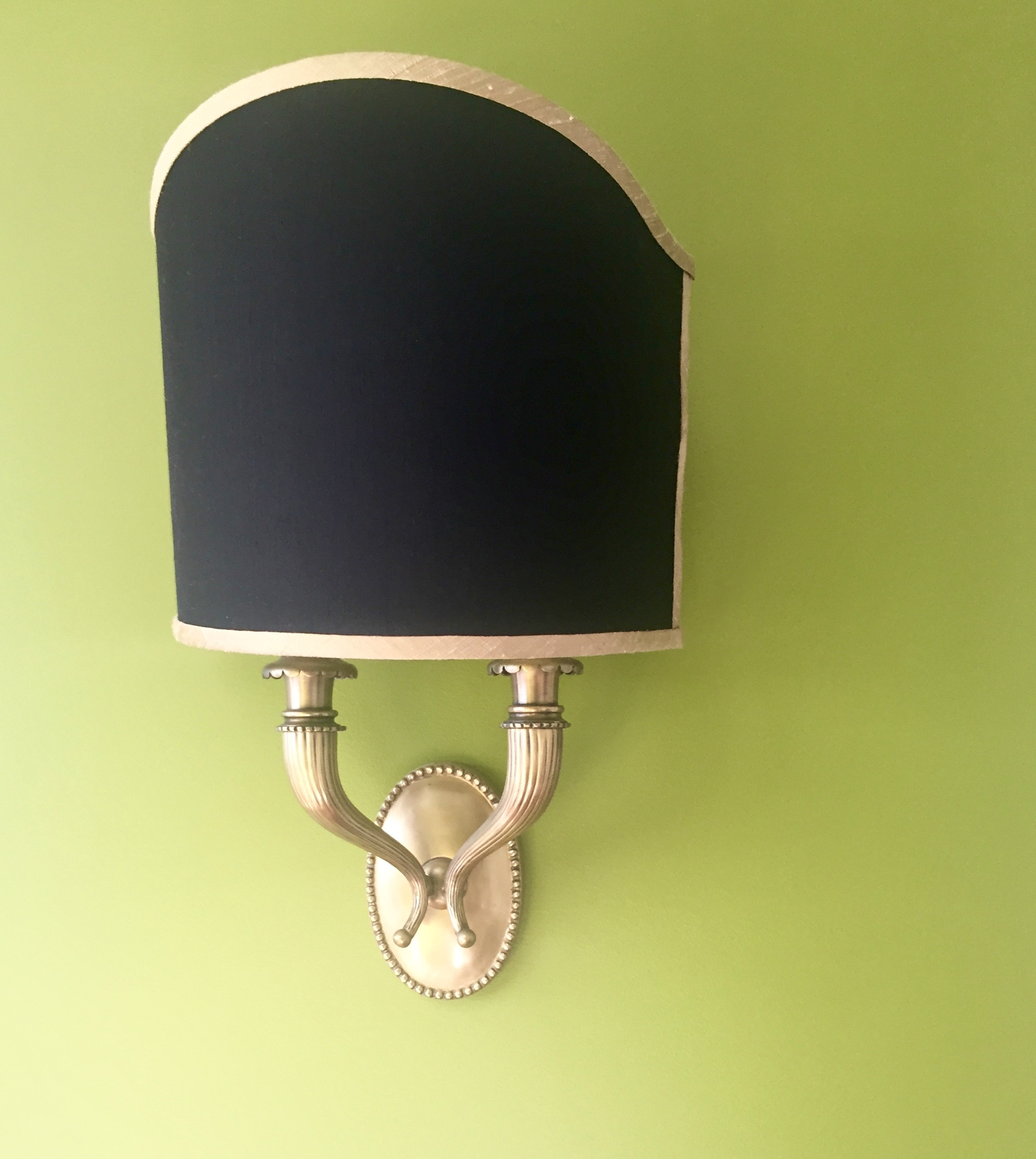
Traditional scones create a modern twist on the green walls.
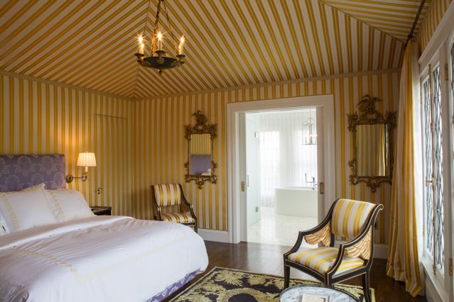
The master. The ceiling was already pitched, so why not tent it. I almost felt like I was taken back to the Four Seasons in Florence. It had that same amount of calm and regality. At the same time, it has such a vibrant attitude.
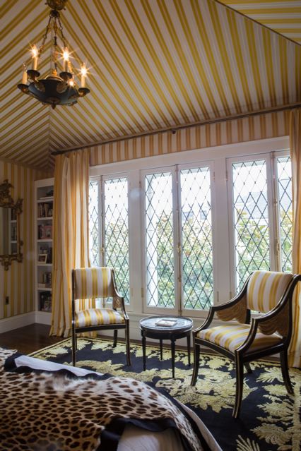
I love the windows. I also love how you can keep windows wide open in San Francisco in all year long.
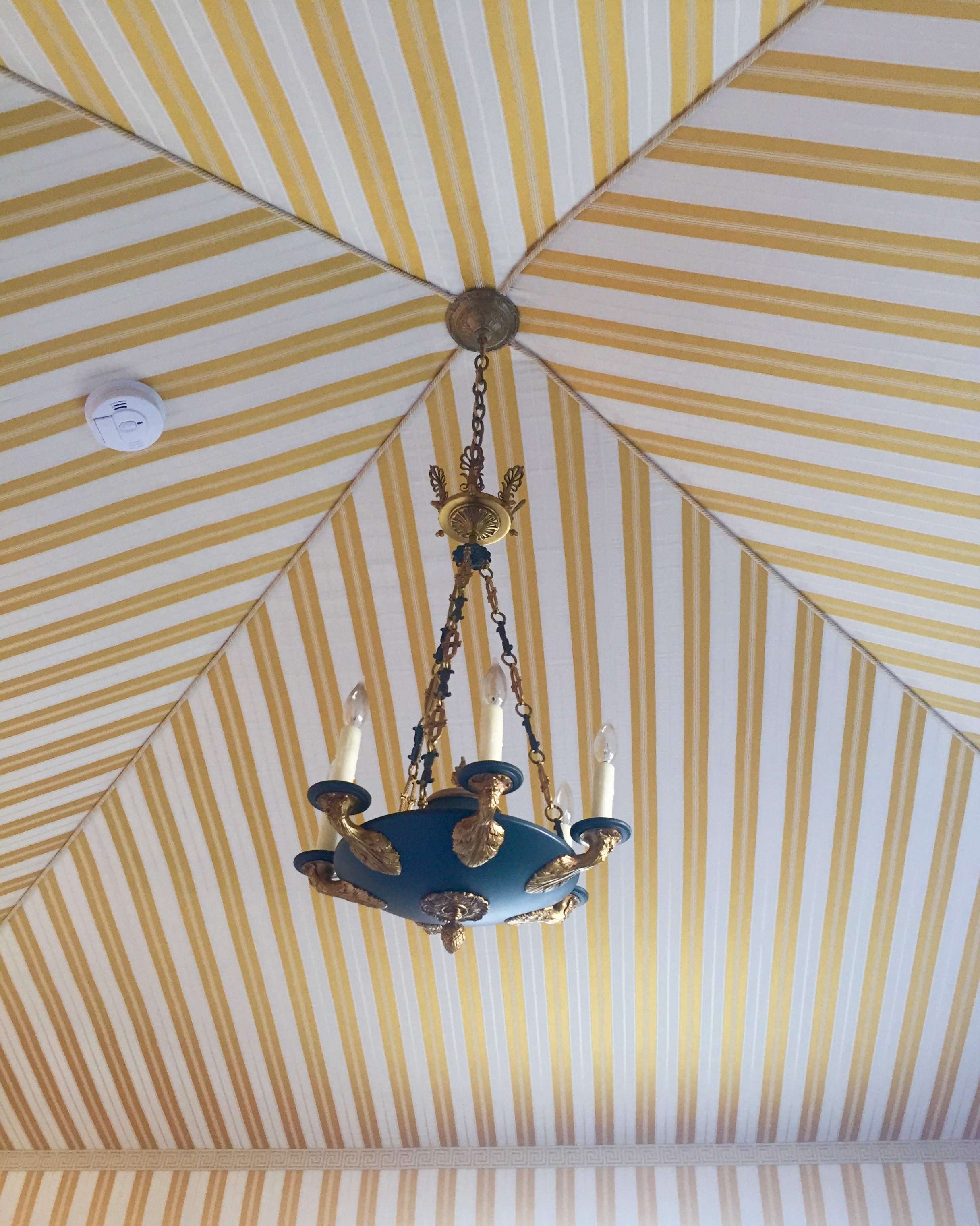
The ceiling.
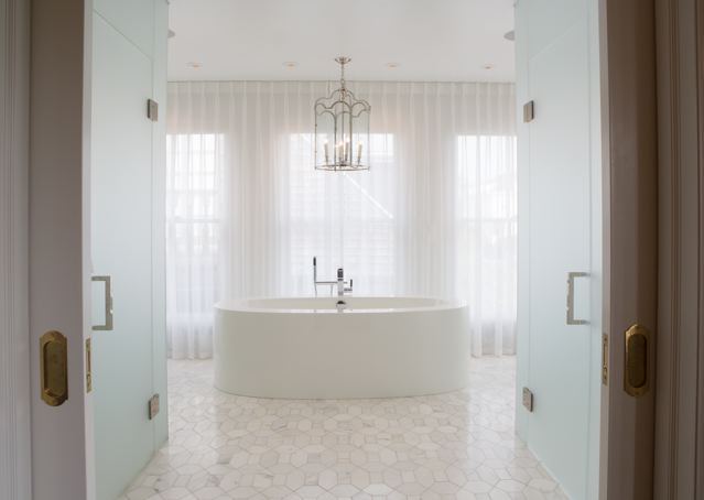
The master bathroom takes a step away from vibrant colors and takes a step back into calming shades of glass, mirrors, and white.
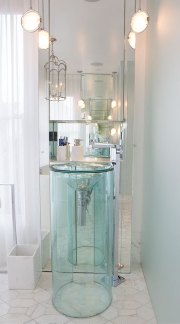
Another bathroom view.
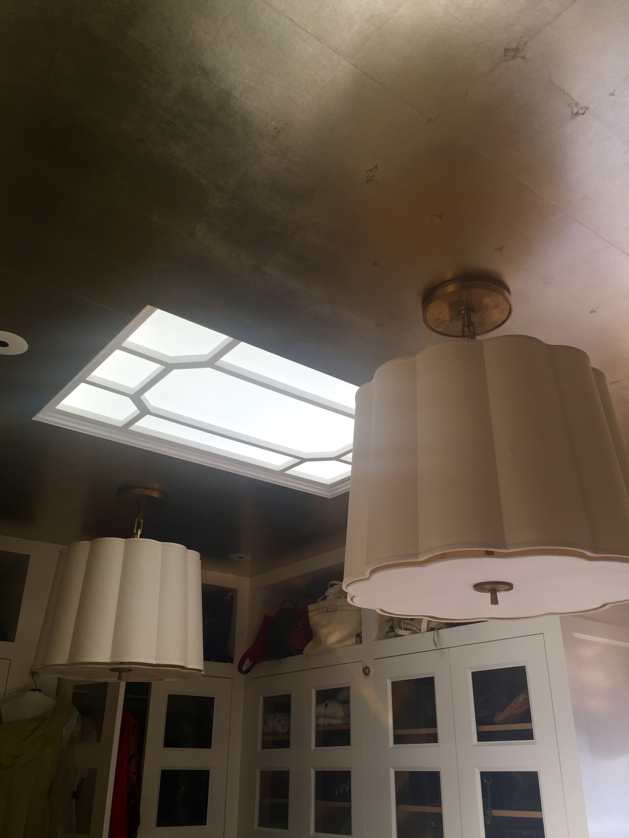
Her closet was incredible. What I loved the most, apart from the doors, was the wallpapered ceiling. An interior architect also designed that perfectly placed frosted skylight. There was no detail left undone. Bravo Kathryn!!

