After yesterday’s post explaining why some designers and homeowners don’t share paint colors, I thought I would share some trusted paint colors that many people love.
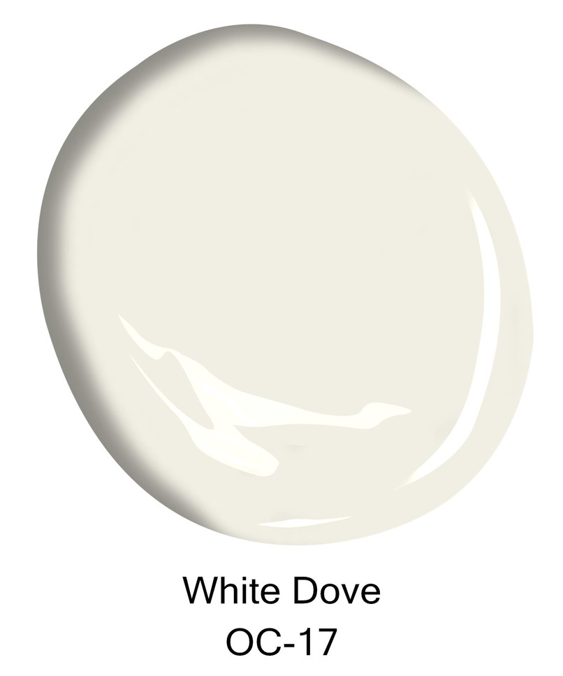
There is a lot of paint out there and a lot of ways for it to be formulated. For instance, a house painted in Benjamin Moore’s White Dove may photograph completely differently than how it looks in real life. The lighting matters and the lighting changes from house to house, room to room, or hour to hour. It takes hard work to find the right shade and finish. Here are some suggestions for a good place to start.
I am mainly focusing on whites and shutter colors!
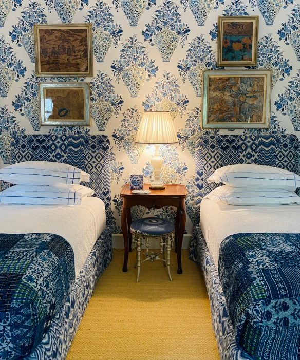
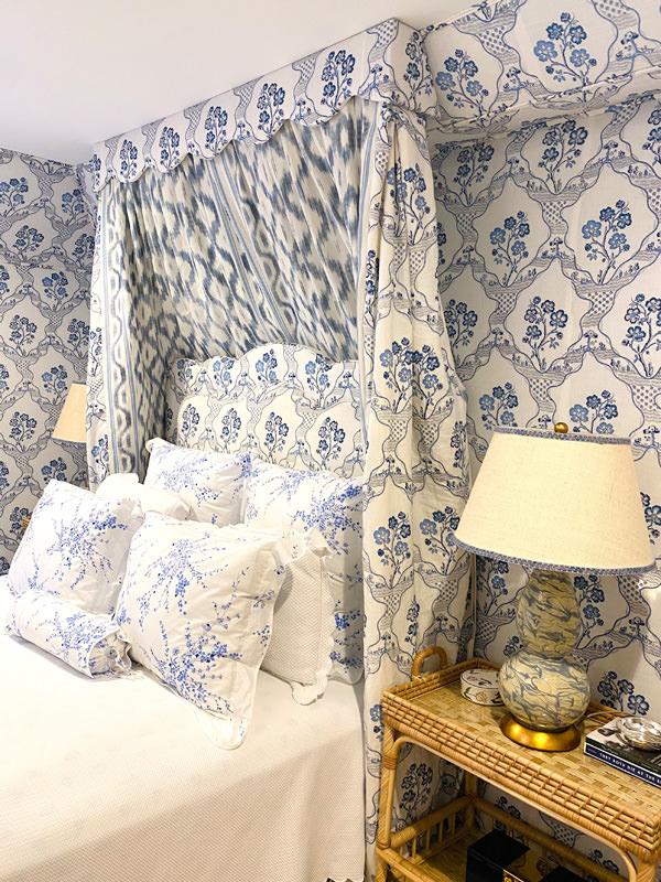
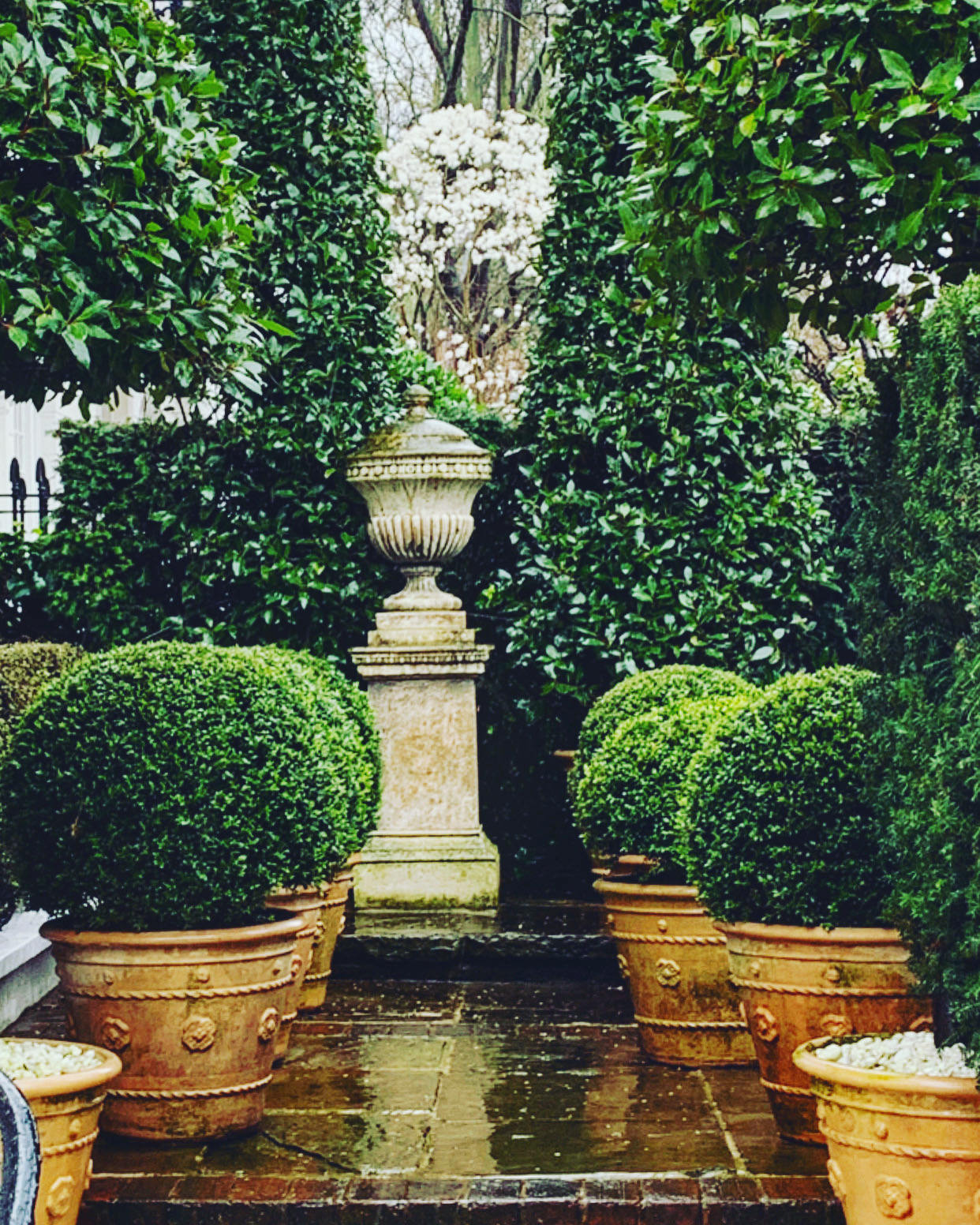
All photos from pinterest unless otherwise noted
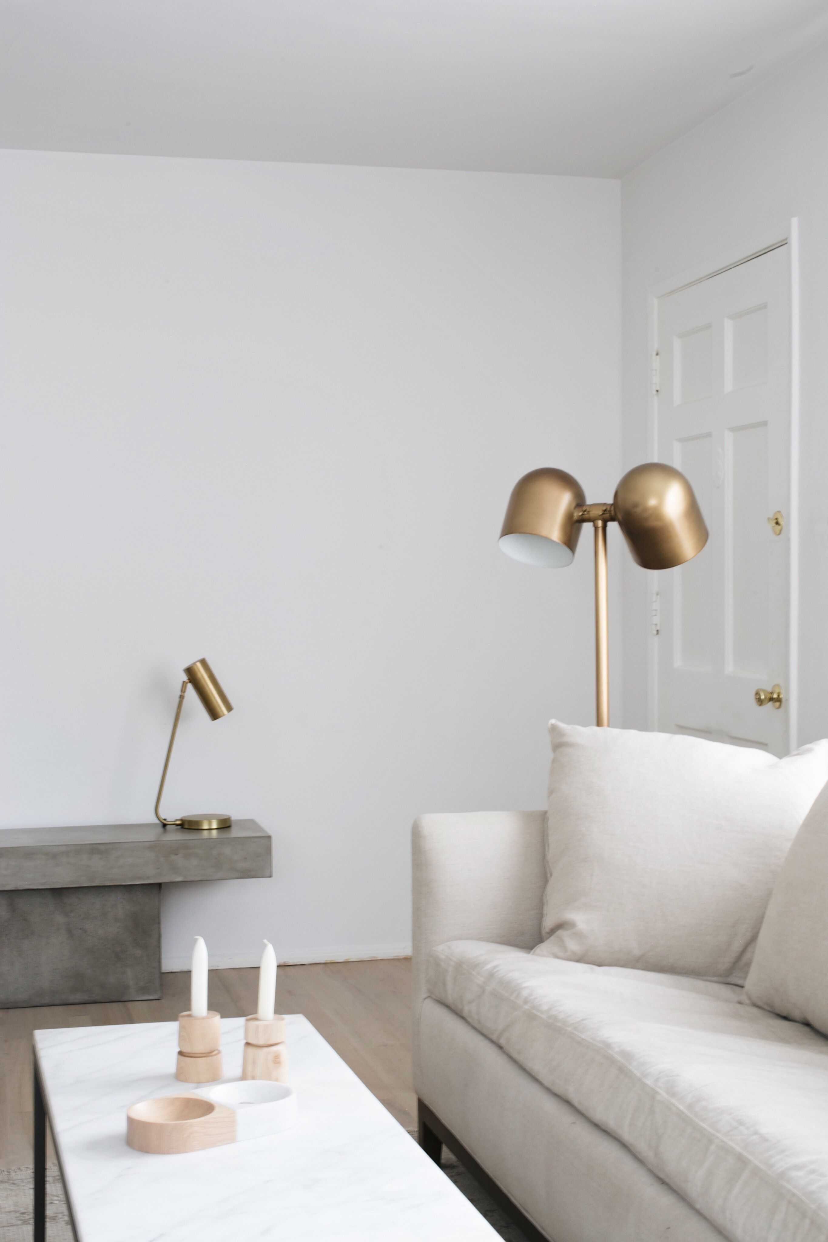
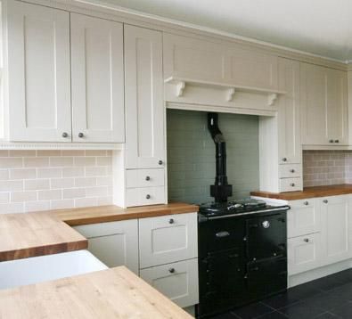
Interior WHITE
Simply White- Benjamin Moore
Wimborne White- Farrow & Ball

White Dove- Benjamin Moore
Wevet- Farrow & Ball
Lily of the Valley- Benjamin Moore
Slipper Satin- Farrow & Ball
Paper White- Benjamin Moore
Pointing- Farrow & Ball
Half Linen/Half White- Benjamin Moore
(I overheard a designer talk about this combination and have yet to forget it)
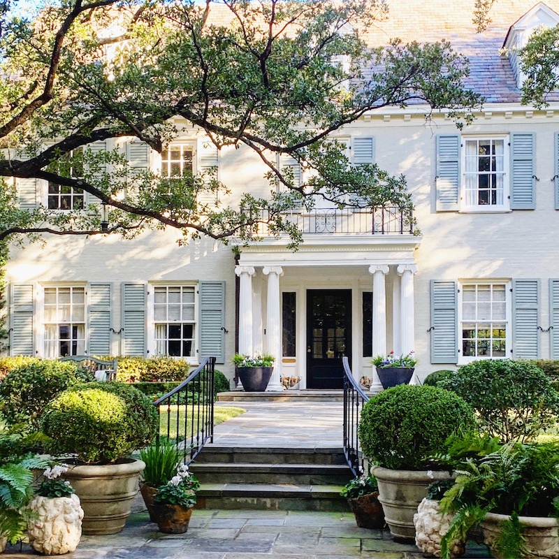
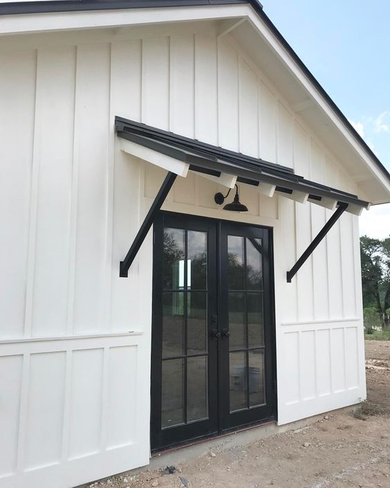
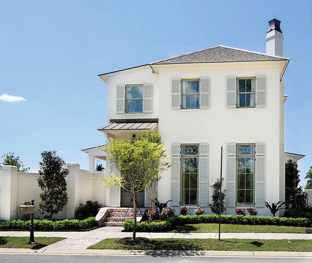
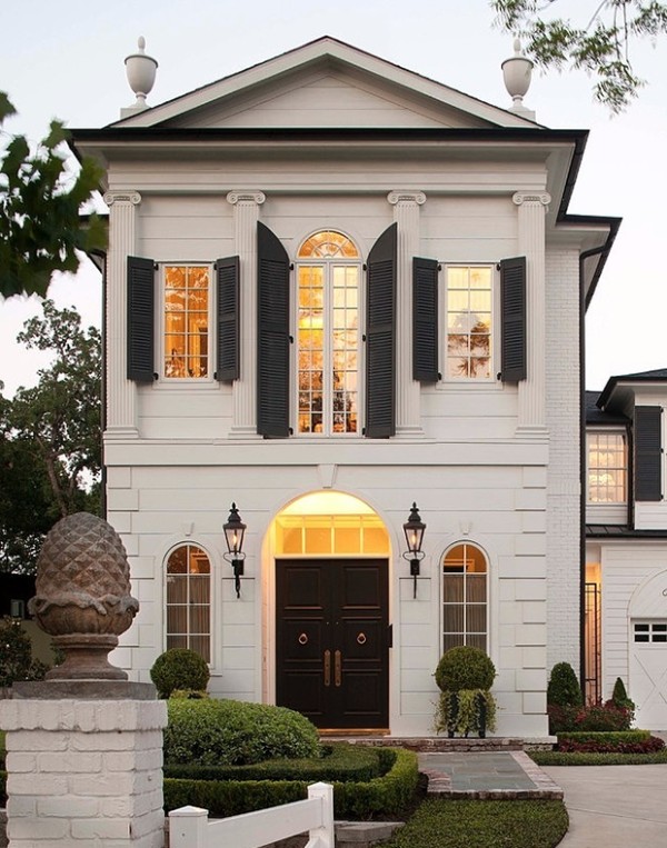
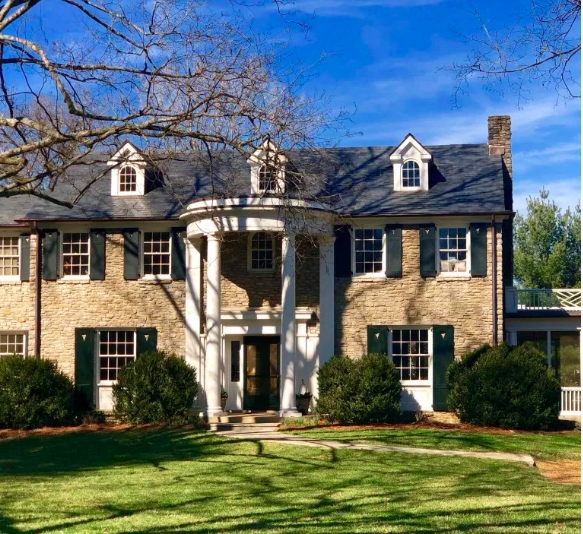
Exterior White
Dover White- Sherwin Williams
Dove Wing- Benjamin Moore
Site White- Sherwin Williams
Simply White- Benjamin Moore
Pure White- Sherwin Williams
Rhinestone- Benjamin Moore
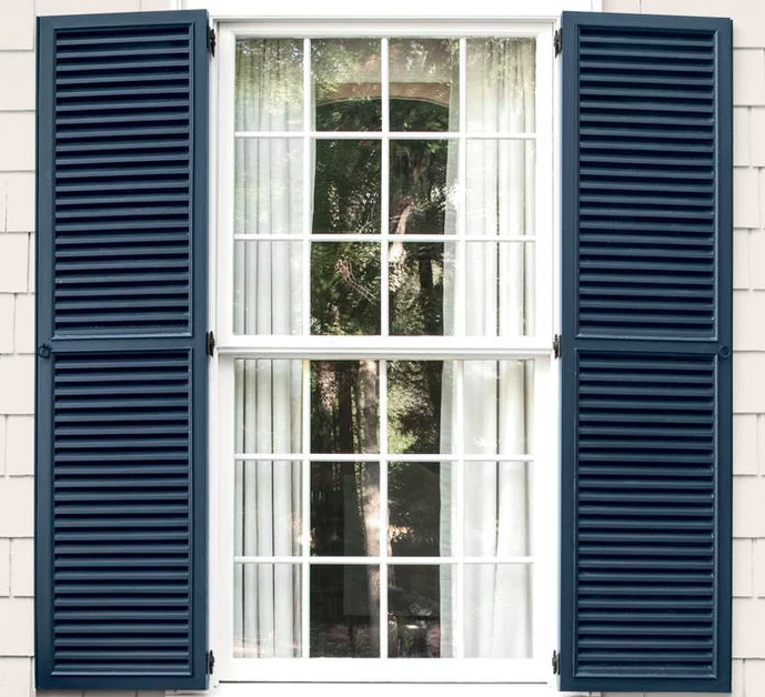
Shutter Colors
Black Blue- Farrow & Ball
Evening Dove- Benjamin Moore
James White- Farrow & Ball
Black Onyx- Benjamin Moore
Belle Meade Green- Benjamin Moore
(see post here)