The most frequently asked question at The Potted Boxwood is:
“What is the paint color?”
I understand why. Finding the right paint color is tricky, and so often it doesn’t turn out the way people envision.Pictures are brightened and edited, plus online doesn’t translate to real life in more ways than one.
How paint looks on someone’s wall or brick will vary based on the lighting, texture, and tones in your home. My mom recently painted her walls Benjamin Moore Swiss Coffee. A popular soft white for exterior or interior. It looked amazing in the hallways, but in the darker afternoon light in my childhood bedroom, it looked dull and yellow. For that room, she used the most popular paint of all- Benjamin Moore White Dove.
One of my friends was ready to paint her house Shoji White. It looked good on the samples, painted on poster board, and even slapped on the existing walls. Once it started going up, it looked terrible. She has beautiful trees in her front yard that cast shade which made it very dark, so instead she went with White Dove. On her home it looks perfectly soft and airy. Paint varies!
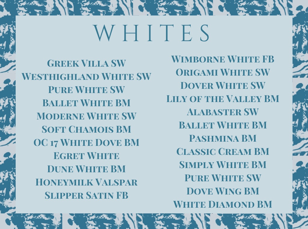
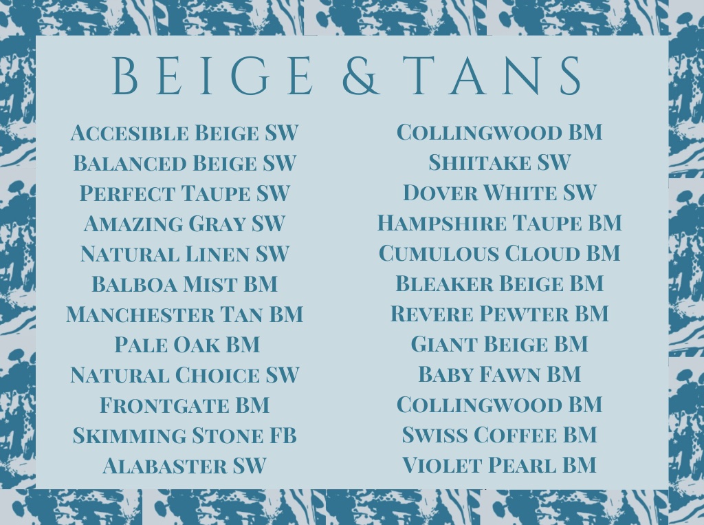
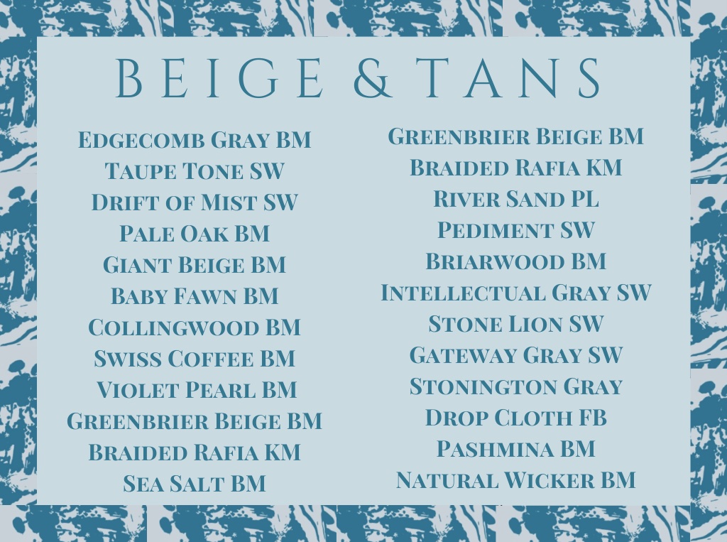
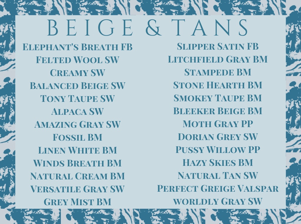
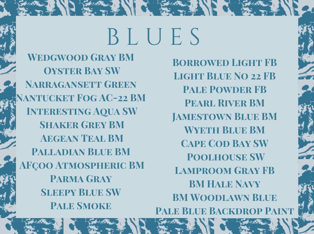
I say this very lovingly- paint is not a one size fits all model, but I do want to list a few of the most popular colors as shared by my followers and designers. This isn’t a complete list, but I am hopeful it will be a helpful resource.
Some painters only work with certain brands. If you find a seasoned paint employee, they typically can color match from other brands. Also, test the paint! It is worth it and will save you money and frustration at the end of the day.

Other notes:
Tuscan colors are beautiful… in Italy. Know your neighborhood. I am speaking directly to you Florida.
Asking a neighbor for paint colors and then painting your house the same exact colors is bad etiquette- Don’t do it!
Avoid textured walls.
What a paint color looks like online, in the can, and on your neighbors wall is not how it will look in or on your house.
Time of day matters- test the paint in all light cycles.
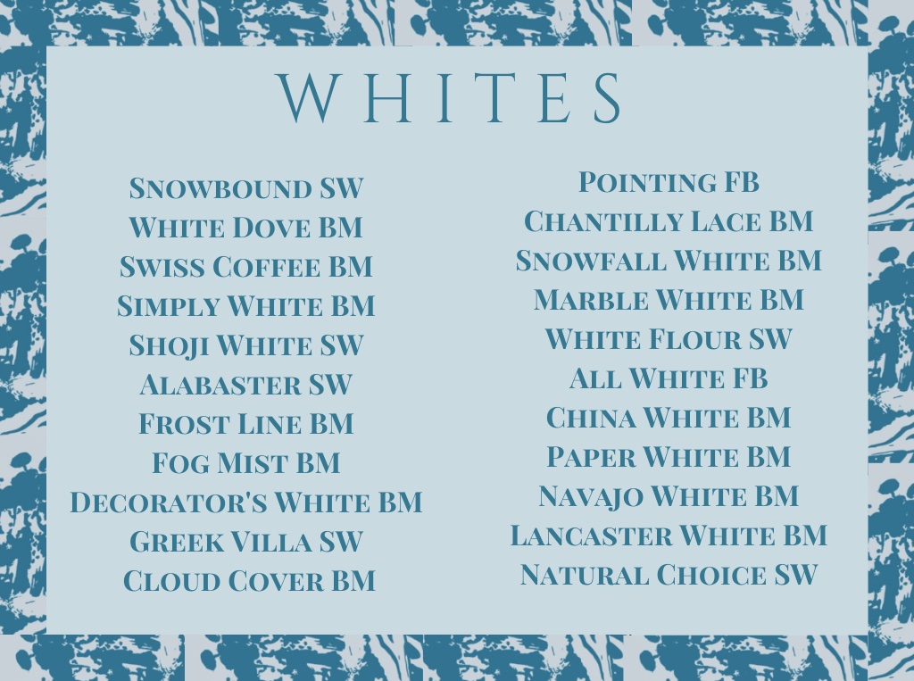
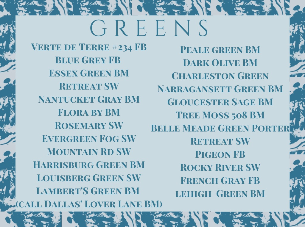
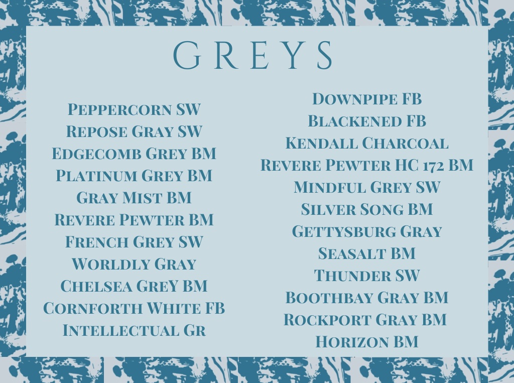
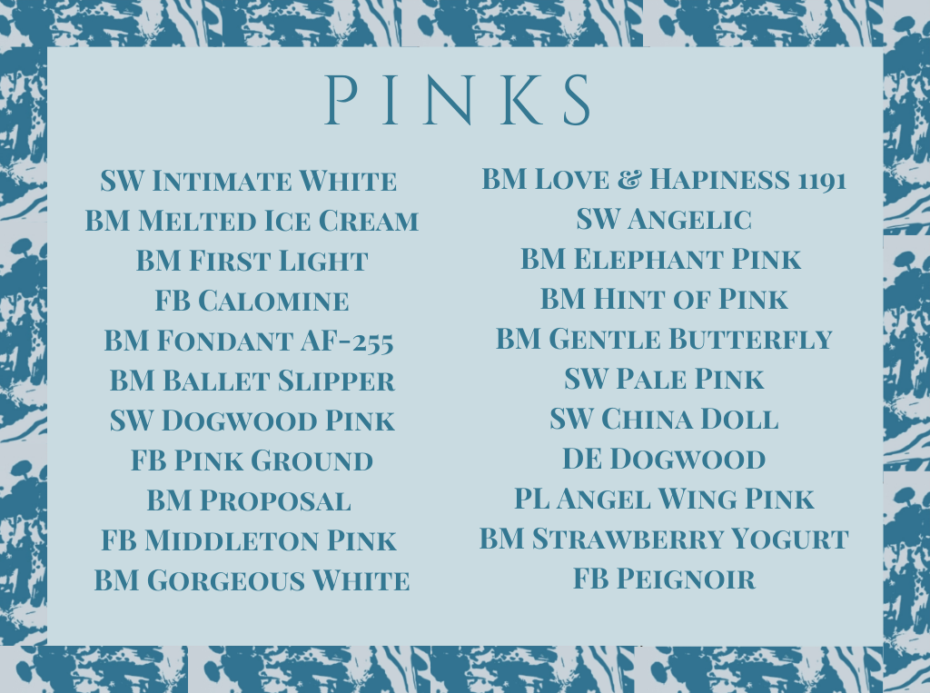
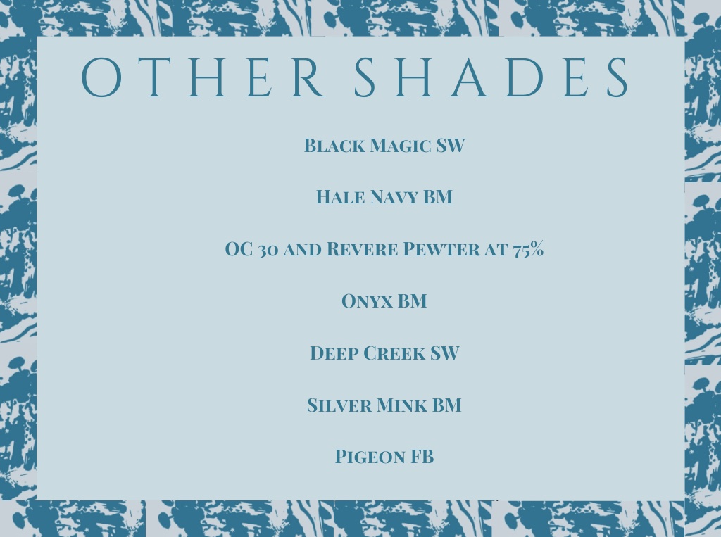
I have arranged the following by genres of colors and popularity, not by shades. For example, Blue Grey by Farrow & Ball is the perfect soft green shade and Studio Green by Farrow & Ball is the perfect chic dark green. They are both under greens!
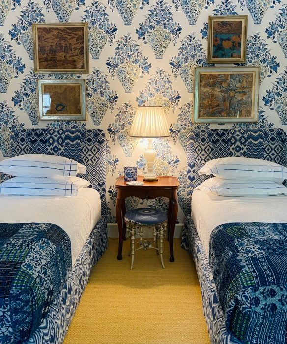
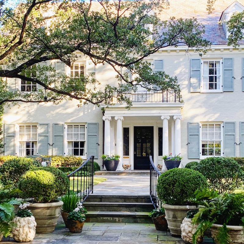
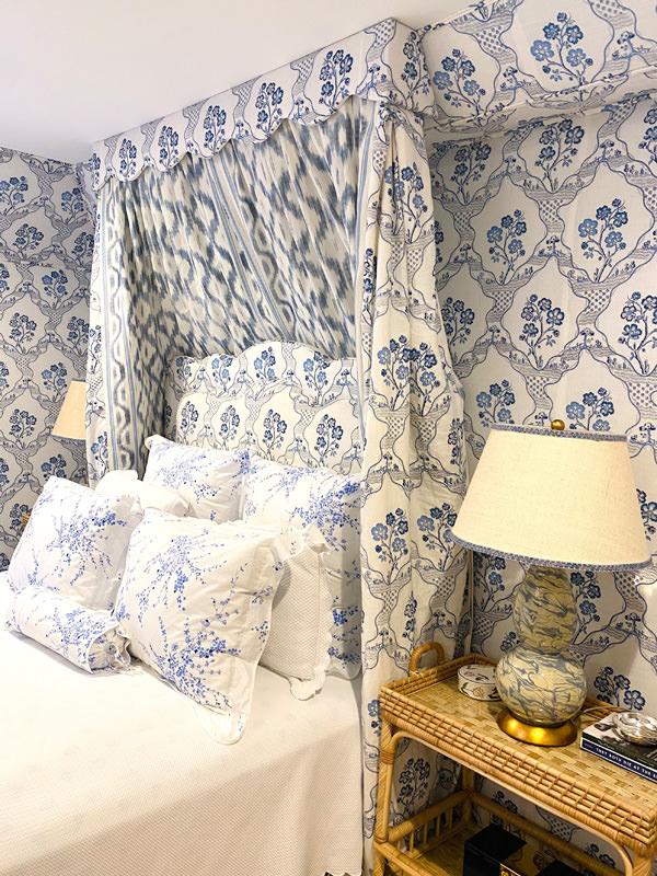
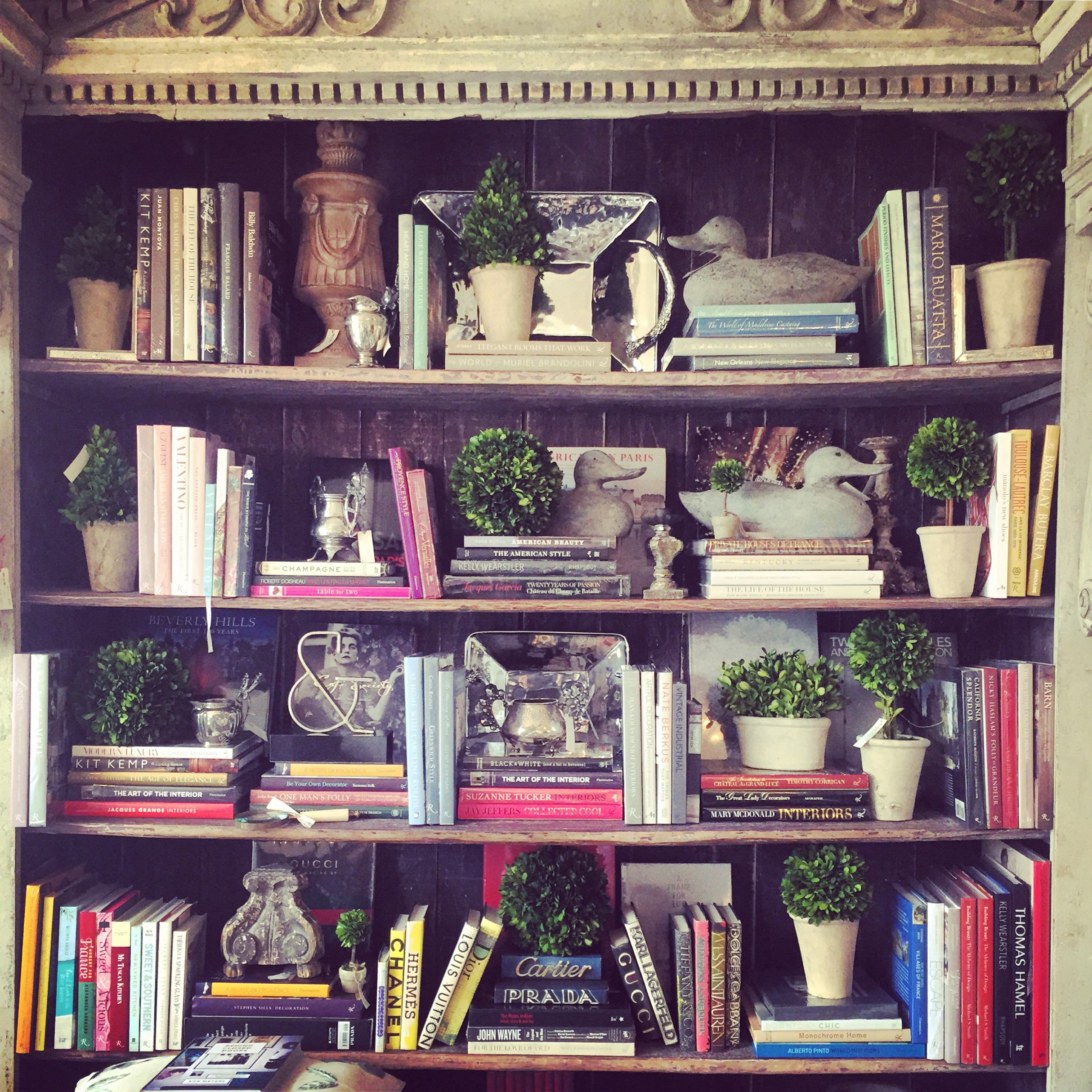
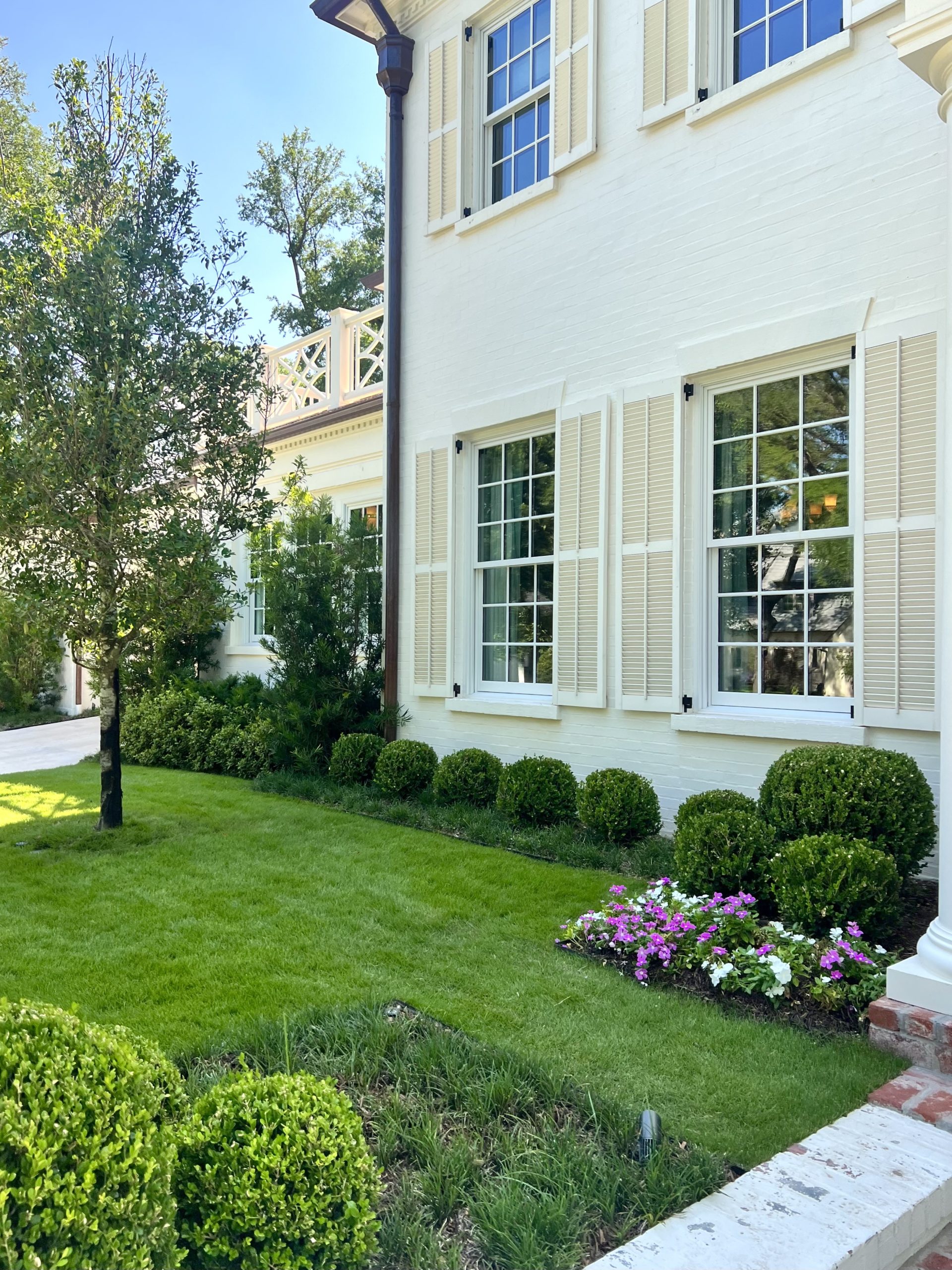
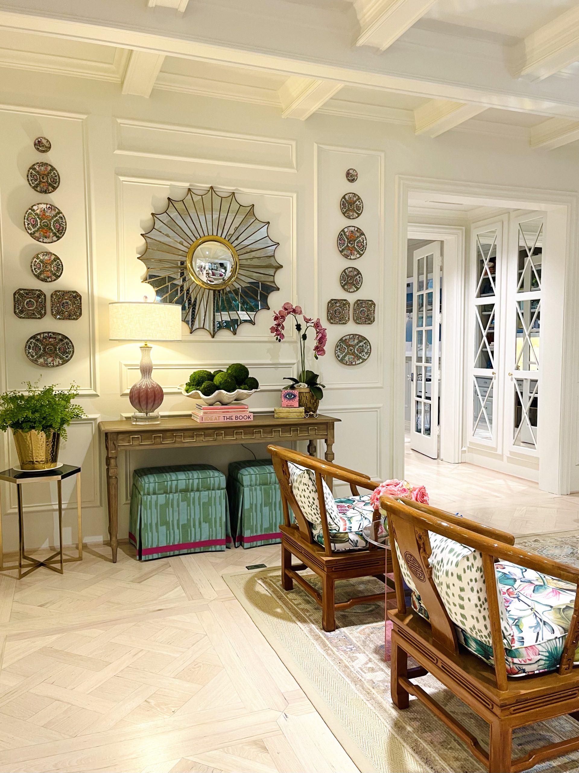
I have also included some pictures of colors used in home tours in the past. Happy Painting!
Snowbound by SW on the home of Tori Rubinson. See tour: HERE
Oyster by BM in the Chic Peek tour with Lacy Lange. See tour: HERE
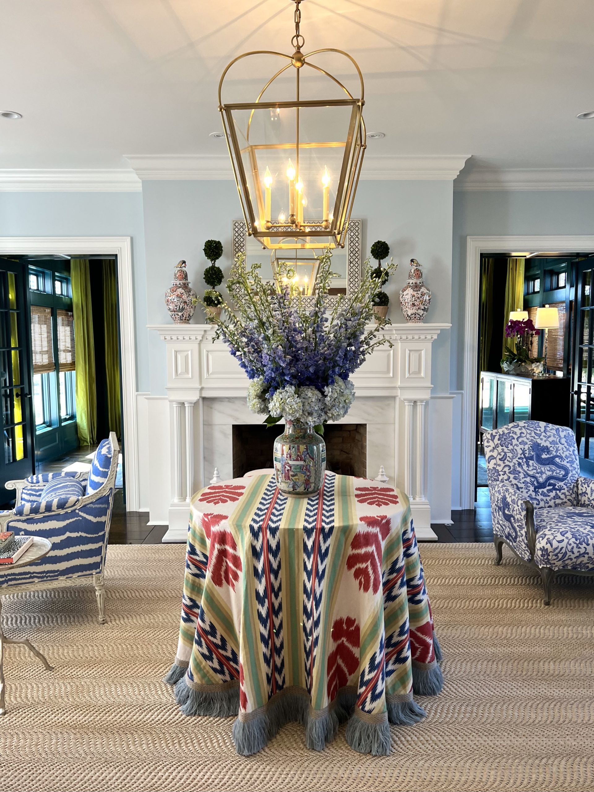
Borrowed Light F&B in a home designed by Sarah Vaile with tour by Anna Fiascone. See tour: HERE
Pale Powder by F&B on the ceiling in the home of Cathy Kincaid. See tour: HERE
Light Blue No. 22 by F&B in the home of Tori Rubinson. See tour: HERE
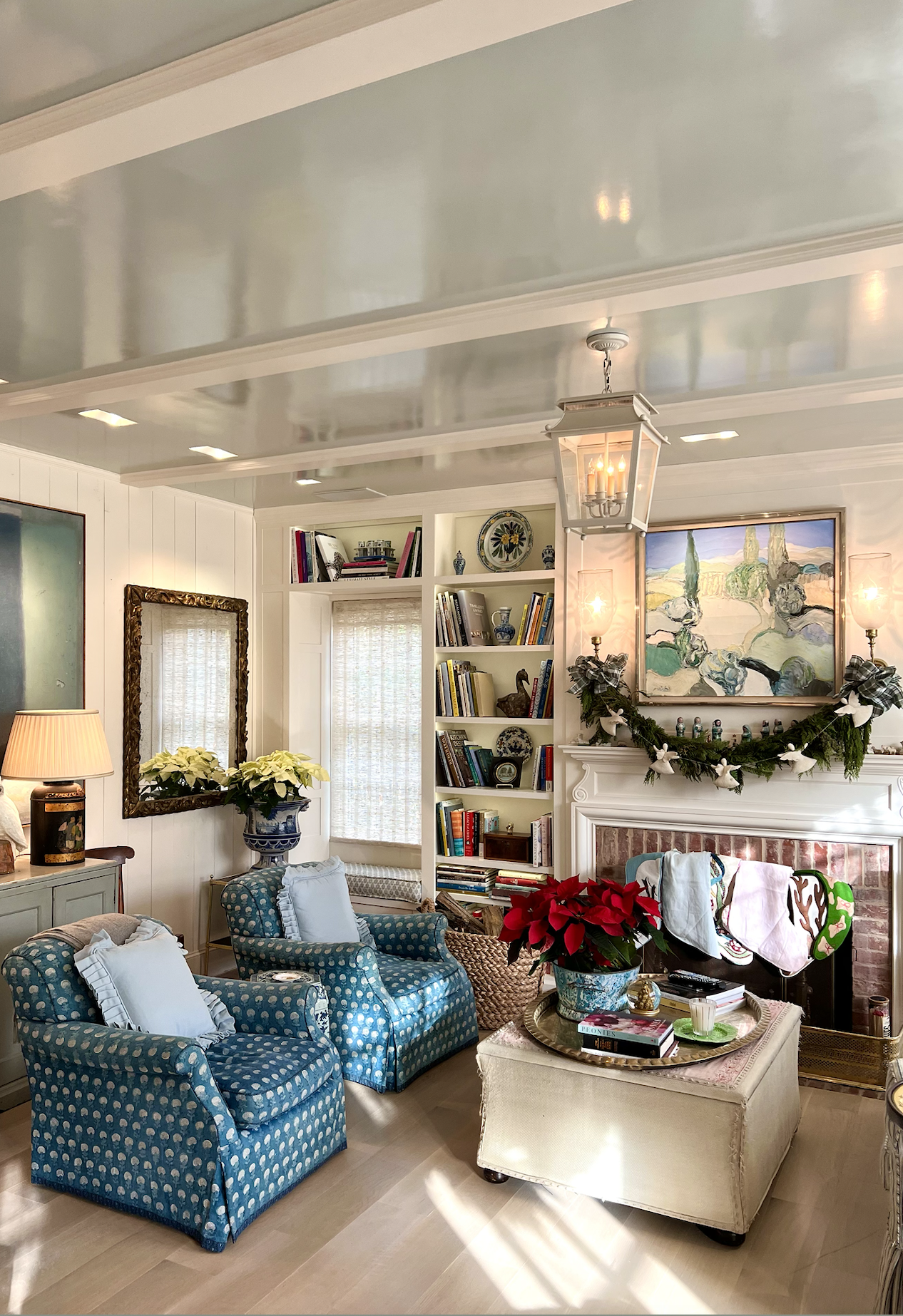
Verte de Terre #234 F&B in the home of Elizabeth Cook (Color matched by SW). See tour: HERE
Studio Green by F&B (Color matched by SW) in the Beyond the Listing tour with Meredith Ferrell. See tour: Here
Raindance by BM in the Chic Peek tour with Lacy Lange. See the tour: Here
Lehigh Green by BM in the home of Cynthia Collins. See tour: HERE
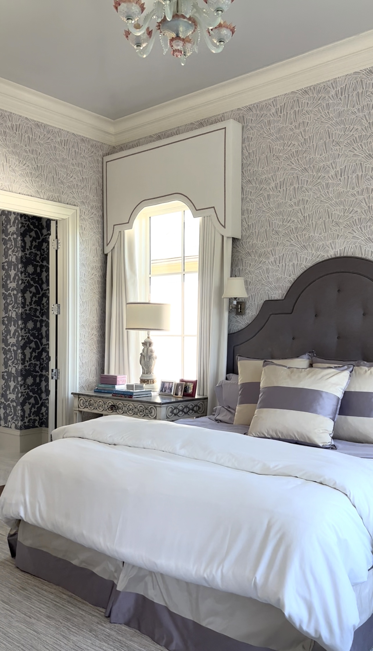
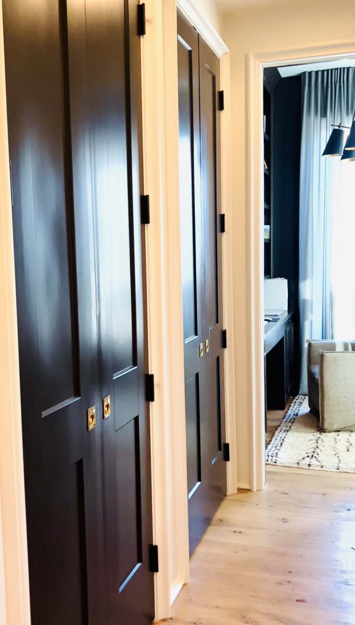
Ceiling is Blackened by F&B in the home of Amity Gillespie. Tour coming soon!
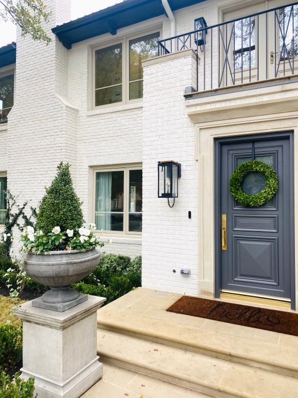
Door is Peppercorn by SW (exterior is White Dove BM) in the home of Austin Fryer. See tour: HERE
Black Magic by SW in the home of Kristie Stewart of Lilliekat Rugs. See tour: HERE